Top Company Landing Page Design Strategies You Can’t Afford to Lose

Design is no longer just art; it is engineering.
Every color choice, button placement, and whitespace decision impacts your bottom line. Yet, many companies rely on “gut feeling” rather than research.
In fact, 38% of people stop engaging with a website if the content or layout is unattractive. This means more than a third of your potential buyers may never move past the first impression your design creates.
Most company landing page design misses the mark because it’s built on scattered feedback, aging assets, and assumptions about buyer intent.
That’s when clarity disappears, consistency fades, and credibility takes a hit.
This guide focuses on the mechanics behind conversion: fixing slow load times, aligning visual hierarchy with intent, and implementing structural improvements that recover lost leads.
Key Takeaways
|
Why Enterprise Landing Page Design Fails
Before we build, we must debug. Most corporate pages fail not because of budget, but because of a lack of focus.

1. Overloaded, Confusing Pages
There is a temptation to say everything at once.
Stakeholders often want every feature and award listed “above the fold,” resulting in cognitive overload.
When a user has to struggle to find information, they leave. Effective visual hierarchy is the antidote. Without guiding the user’s eye, you create a chaotic experience where important information gets lost.
2. Generic, Weak Messaging
|
“We provide world-class solutions for forward-thinking businesses.” |
This sentence means nothing, yet it plagues the B2B world.
Weak messaging forces users to guess what you do.
If your brand identity isn’t distinct and your copy doesn’t address specific pain points immediately, you are indistinguishable from the competition.
3. Slow, High-Friction Load Times
Issues with page load speed optimization are often caused by uncompressed images, bloated JS files, or messy CSS.
If you ignore Core Web Vitals, you risk being penalized by Google and abandoned by users expecting fast-loading landing pages.
4. Misaligned or Weak CTAs
A call-to-action (CTA) that simply says “Submit” is a missed opportunity.
Hiding a CTA at the bottom of a page is a waste of space.
Many pages fail because the conversion point isn’t compelling. The CTA must be the logical conclusion of the user’s journey, not an afterthought.
5. Ignoring CRO Fundamentals
Design without data is decoration. Failing to implement conversion rate optimization (CRO) principles means you are guessing.
Without analyzing website conversion funnel drop-off points, you cannot understand why users are leaving without converting.
Types of Landing Page Testing
|
Testing Type |
What It Evaluates |
When to Use |
|
A/B Testing |
Single-variable changes |
Improving CTA, headlines |
|
Multivariate Testing |
Multiple elements at once |
High-traffic enterprise pages |
|
Usability Testing |
User difficulties |
Pre-launch redesigns |
|
Heatmap Analysis |
Scroll & click behavior |
Analyzing drop-off points |
|
Session Recordings |
Real visitor behavior |
Identifying friction patterns |
The User Flow Strategies That Aligns With Real Buyer Intent
To fix these issues, we must pivot from “what we want to say” to “what the user needs to hear.”
Strategy 1: Message Clarity
The primary goal is to answer one question: “Am I in the right place?”
Addressing the Pain: Unclear Messaging
When visitors can’t immediately understand what your company offers or why it matters to them, they lose interest and move on.
Approaches
- Above-the-Fold Precision: Your hero section is prime real estate. It needs a benefit-driven headline, an explanatory sub-headline, and a primary CTA. The hero image should support the text rather than distract. This above-the-fold content must stand on its own.
- The Five-Second Test: If a user cannot understand your product in five seconds, you must simplify, using clear HTML structure to prioritize headings.
- Establishing Clear Visual Hierarchy: Use size, color, and spacing to signal importance. Your Layout structure should lead the eye naturally from the headline to the benefit, and ultimately to the form.
Real World Scenario:
|
An ecommerce store can run great ads and still lose buyers if the landing page doesn’t hold up. A team skilled in landing page design services for ecommerce stores can spot the weak points, messaging gaps, visual inconsistency, slow load times, and rebuild the page around what shoppers need to see to stay and buy. |
Strategy 2: Building Trust
In B2B, nobody gets fired for hiring a safe option. You need to be that safe option.
Addressing the Pain: Weak Credibility
A landing page for business without social proof is like a resume without references. It claims excellence but proves nothing.
Approaches
- Strategic Placement of Trust Elements: Don’t bury credentials; place security badges and partner icons near email capture forms to reduce friction.
- Effective Client Logo Bars: Use grayscale logos to immediately signal market acceptance.
- Targeted, Industry-Relevant Testimonials: If you are offering web design for mortgage brokers, display testimonials from mortgage brokers because specificity sells.
- Using Data-Backed Proof Points: “We increased revenue by 30%” is far superior to “We help you grow.” Use analytics tracking (GA4, heatmaps) to verify which proof points engage users most.
- Demonstrating Expertise: As a specialized web design company, showing portfolio pieces or case studies proves capability better than sales copy.
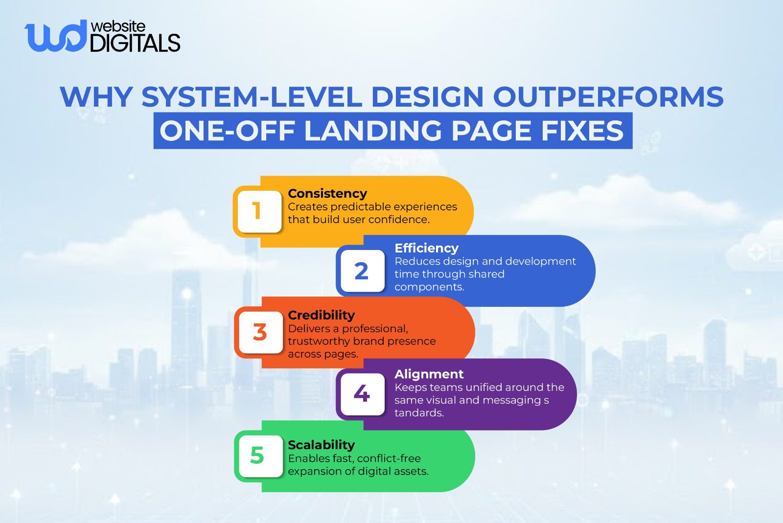
Strategy 3: Design Consistency
Inconsistency creates anxiety. If your ad, landing page, and checkout all look different, users sense a scam.
Addressing the Pain: Design Inconsistencies
Disjointed UI design breaks the experience.
Approaches
- System-Driven Cohesion: Your UX design must be fluid. The color palette in your PPC landing pages must match your main site for brand recall.
- Standardizing Core Components: Ensure buttons and headers behave consistently across all pages.
- Whitespace Design: Give elements room to breathe to make content digestible and professional.
- Ensuring Mobile Integrity: A responsive landing page is non-negotiable. Mobile optimization means resizing touch targets and ensuring legibility without zooming.
- Adhering to Accessibility Standards: Follow accessibility standards (WCAG) to ensure you don’t alienate users or face legal liability.
Bonus Tip: Prioritize Message Match From Ad to Landing Page
|
Most enterprise drop-offs happen because the ad promise doesn’t match the landing page message. Keep the headline, offer, and visual mood consistent across your PPC ads and landing page to maintain trust and reduce bounce. |
Real-World Case Study: Slack Redesign
|
Slack’s team worked with designers and researchers to simplify their interface, strip away unnecessary elements, and align layout and visual hierarchy with real-user needs. |
Final Action: Securing Your Enterprise Landing Page Redesign
The difference between a bounce and a lead often comes down to pixels.
Whether you need web design services to overhaul a legacy site or website optimization to squeeze ROI from traffic, the principles remain: Clarity, Trust, and Consistency.
Don’t let conversion-focused design be an afterthought. If you are ready to stop losing leads to “leaky” pages, audit your assets now.
If you’re ready to strengthen your company landing page design and stop losing leads to avoidable friction, this is the moment to audit your assets and fix the structural issues holding conversions back.
To build a high-performance landing page that supports real revenue goals, connect with our experts at Website Digitals. You can reach us at info@websitedigitals.com or speak with our team directly at (646)-222-3598.
We’re here to help you turn your landing page into a true conversion engine.
FAQs
How can Website Digitals improve our company’s landing page design?
Website Digitals creates clarity-driven, trust-building, and conversion-focused landing pages tailored for high-value buyers.
Does Website Digitals offer redesign consultations for enterprise teams?
Yes. We provide full landing page audits, design system alignment, and performance optimization for enterprise-level redesigns.
How do I design a company landing page that converts?
Focus on clarity, trust signals, fast load times, and a strong above-the-fold message that answers who you are and what value you offer.
What are the best company landing page examples to learn from?
Companies like Slack, Stripe, and Asana showcase excellent clarity, hierarchy, and trust elements that guide users smoothly toward conversion.
What makes a great business landing page?
Clear messaging, consistent design, strong CTAs, relevant proof points, and a layout that guides users logically through the offer.
What landing page design tips should companies follow?
Use scannable sections, reduce friction, maintain brand consistency, and optimize performance across devices.
What should a company’s landing page include?
A value-driven headline, benefit-focused subtext, supporting visuals, trust elements, simplified forms, and a clear CTA.
How can I improve landing page conversion?
Test messaging, strengthen CTAs, refine hierarchy, remove distractions, and use behavioral analytics to guide optimizations.


