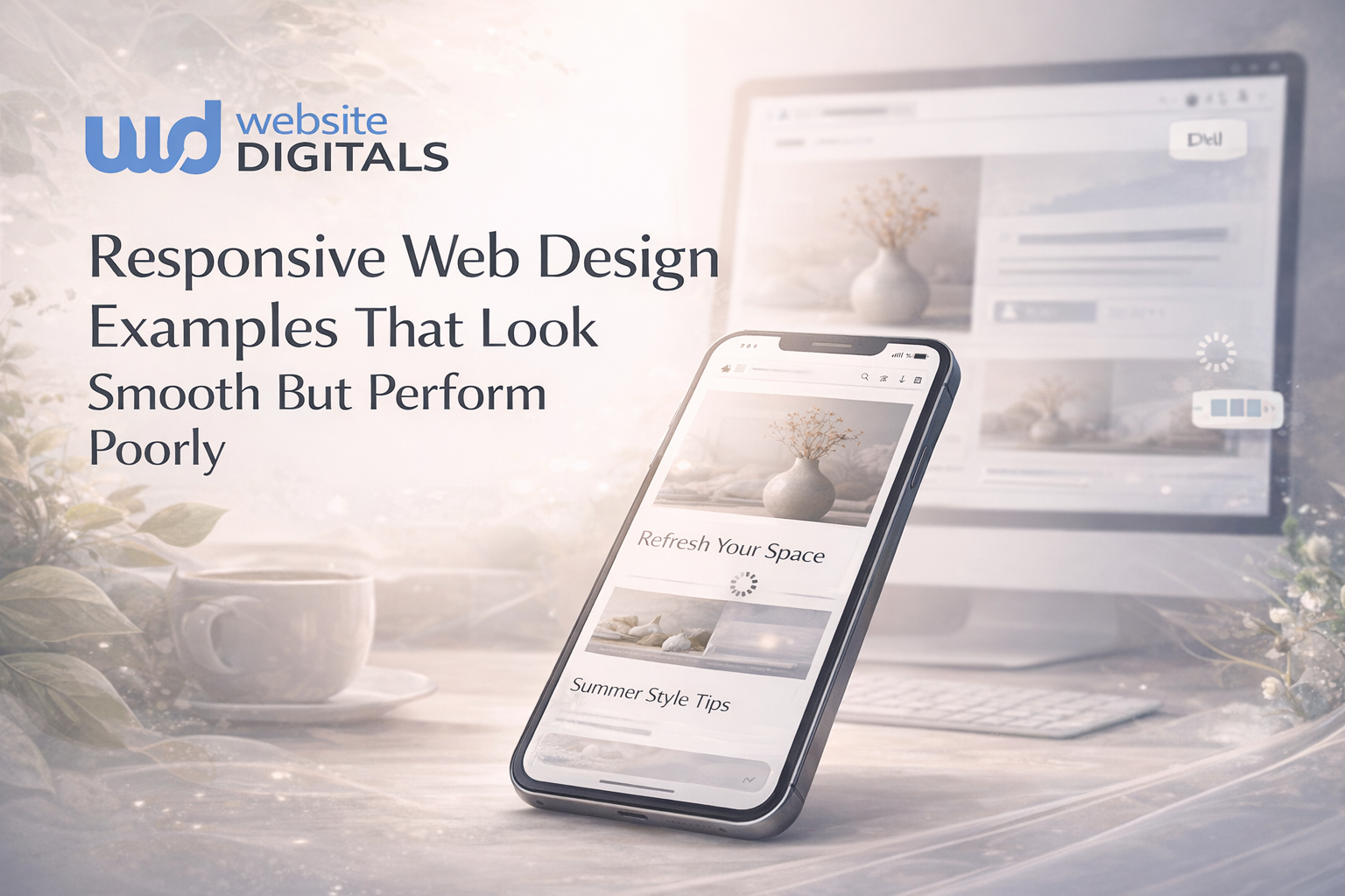
Responsive Web Design Techniques That Make Any Website Look Better on Every Device

A site may look flawless on desktop, but if the mobile experience collapses, revenue quietly bleeds away. Mobile grid instability, inconsistent breakpoints, and slow performance don’t just frustrate users, they directly impact conversions.
When page load time increases from 1s to 3s, the bounce rate rises 32%.
The answer isn’t another framework; it’s mastering responsive web design techniques that keep layouts steady and performance strong across every device.
As Charles Eames stated,
“The details are not the details. They make the design”
And today, those details decide whether users stay or vanish.
A stable, responsive foundation is no longer optional; it’s one of the fastest ways to retain users and avoid preventable revenue loss.
Keep reading to learn how to strengthen yours.
Key Takeaways
|

Why Responsive Design Still Shapes Modern Web Experience
Your website is more than a visual asset; it’s the core of your digital strategy, sales pipeline, and brand reputation.
Users expect an experience that works flawlessly, regardless of what device they’re holding.
That requires a shift away from outdated desktop-first thinking and toward true mobile-first design.
Today’s traffic comes from an enormous spectrum of devices:
- Phones
- Tablets
- Laptops
- High-density screens
- Even unconventional displays.
Designing for cross-device compatibility means building layouts that adapt to every combination of screen size, orientation, and pixel density.
Whether the focus is on a complex B2B application or portfolio website creation, users expect the same level of stability and consistency across every device.
-
The True Cost of UX Disruption
Users can instantly sense when a layout breaks.
A CTA that disappears below a fold, a paragraph that becomes unreadable, or navigation that shifts unexpectedly increases friction.
Poor responsive typography, inconsistent spacing, and broken components disrupt the flow and undermine the user experience design (UX) you’re trying to achieve.
Real World Case Study:
|
The Boston Globe became a landmark example of responsive web design when it rebuilt its entire site around flexible grids (a move many modern web design company teams now study as a model for large-scale responsive transformation). By replacing multiple device-specific templates with one responsive system, the Globe delivered a consistent reading experience across phones, tablets, and desktops while reducing long-term maintenance. Its redesign was widely recognized as a breakthrough in modern responsive strategy and was featured by Wired for its innovative execution. |
Responsive Design Mistakes Beginners Commonly Make
|
Mistake |
Why It Happens |
Long-Term Impact |
|
Overusing pixel-based units |
Designers rely on outdated habits |
Causes scaling issues across devices |
|
Designing desktop-first |
Old workflows, unclear priorities |
Leads to broken mobile layouts |
|
Ignoring testing on real devices |
Time constraints |
Missed layout bugs, poor UX |
|
Oversized hero sections |
Aesthetic choices overriding UX |
Pushes key content below the fold |
|
Applying too many breakpoints |
Lack of planning |
Maintenance becomes complex |
The Hidden Financial and Operational Costs of Neglect
Poor responsiveness doesn’t just create frustration; it translates directly into lost revenue and wasted development time.
-
Broken Layout Consequences
Even small responsive issues, such as misaligned buttons or cropped form fields, can block conversions entirely.
In high-value industries, these errors undermine trust and significantly reduce ROI from paid traffic.
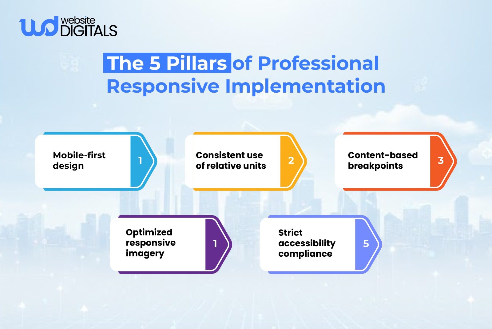
Solution: Implement a Consistent Responsive Layout Framework
To avoid conversion-killing layout failures, teams should:
- Establish a unified grid system (CSS Grid for structure, Flexbox for alignment).
- Define content-based breakpoints instead of relying on outdated device-width rules.
- Use intrinsic sizing techniques (min-content, max-content, fit-content) to prevent overflow or clipping.
- Adopt a shared UI (User Interface) library with pre-tested responsive components.
This creates predictable behavior and eliminates the inconsistencies that typically break conversions, making it far easier for top responsive web design service providers to scale new features without layout regressions.
-
Mitigating Engineering Rework
When foundational elements like fluid grids, HTML5/CSS3 structure, and clear breakpoint definitions are missing, developers fall into an endless cycle of patching.
This slows releases, increases costs, and creates long-term scaling issues.
Replacing fixed pixel values with rem, em, and viewport units dramatically reduces this rework.
Solution: Build a Responsive Architecture From the Ground Up
To reduce rework and technical debt, focus on:
- Designing with a mobile-first structure, then scaling upward.
- Standardizing layout tokens (spacing, typography, radii, breakpoints).
- Using relative units everywhere to maintain proportional scaling.
- Documenting responsive behavior in your design system so developers don’t reinvent the solution for each component.
- Setting up automated visual regression testing to catch layout bugs early.
This ensures the foundation doesn’t break when new features, content types, or components are added.
Architectural Foundations for Resilient Layouts
A reliable responsive system starts with a stable architecture, not quick fixes.
-
Leveraging Smart Grid Systems
Modern browsers offer powerful layout tools. CSS Grid responsiveness gives you full control over two-dimensional structures, while flexbox responsive layout handles directional alignment with precision.
Used together, they eliminate many common layout issues that older grid methods often introduce.
Note:
|
While CSS Grid excels at structuring complex layouts, Flexbox remains the better choice for aligning items in a single direction. Mixing both is not only normal, it’s considered best practice when aiming for cleaner, more predictable responsive behavior. |
-
Establishing Scalable Systems
Scalable design is about using flexible images, proportional spacing, and relative units across your entire layout.
This approach maintains visual hierarchy and ensures your design adjusts naturally to every screen size.
Addressing Critical Responsive Design Vulnerabilities
Many responsive failures happen at the edges, when screen sizes or content lengths reach unexpected thresholds.
-
Content-Driven Breakpoints
Instead of relying on outdated device-based breakpoints, modern design uses content-based breakpoints.
Layout shifts occur only when components need structural adjustments. This results in more predictable adaptive layout behavior.
-
Guaranteeing Grid Stability
Techniques like using fractional units and the minmax() function keep content aligned and prevent collapse or overflow, especially in multi-column designs.
-
Eliminating Performance Overhead
Unoptimized assets remain the number one factor hurting web performance.
Large images, unused scripts, and bloated CSS degrade scores on Google PageSpeed Insights, Web Vitals, and Lighthouse, creating a slow and frustrating user experience.
Advanced Techniques for Component Resilience
-
Stable Grid Structure and Module Selection
A balanced combination of Flexbox, Grid, and selectively applied CSS media queries ensures your layout holds up under varied conditions.
This combination supports everything from simple UI components to complex, multi-section pages.
-
Adaptive Components with Container Queries
Container Queries are one of the most impactful modern advancements. Instead of responding to viewport size, components adapt to the space available inside their parent container.
This dramatically improves component reliability, especially when working within responsive frameworks like Bootstrap or Tailwind CSS.
Achieving Visual Precision Through Fluidity
Implementing a Fluid Type Scale
Typography should scale smoothly across devices. Using a fluid type scale with CSS functions like clamp() or calc() creates consistent readability and avoids abrupt jumps in size.
Establishing Consistent Spacing Rules
Spacing systems built on rem/em units maintain alignment and structure, reinforce visual hierarchy, and support accessibility standards such as required touch target spacing.
Strategic Optimization of Assets and Imagery
Modern Formats and Load Stability
Switching to WebP, AVIF, SVG, and properly configured responsive image attributes (srcset, sizes) makes an immediate impact on both performance and clarity.
Always setting width and height on images prevents layout shifts, improving user experience and Core Web Vitals performance.
Tips for Smoother Responsive Execution
|
Small adjustments can make a big difference in responsive behavior.
These microchecks help catch subtle issues early. |
Modern Tools for Efficient Development
-
Container Queries: Enhancing Modularity
Container Queries directly address issues caused by rigid, viewport-driven breakpoints.
They make components more reusable and significantly reduce layout inconsistencies.
-
The Progressive Enhancement Methodology
Build the essential mobile experience first, then progressively enhance.
This ensures universal functionality while allowing modern browsers to take advantage of advanced layout features.
Rigorous Testing for Quality Assurance
-
Automated Testing and Compliance Audits
Visual diffing, responsive testing tools, and audits through Lighthouse and Web Vitals expose layout issues early, long before deployment.
-
Real-World Device Validation
No emulator beats real hardware.
Testing across actual devices confirms proper behavior for mobile UX patterns, browser quirks, and accessibility expectations.
Establishing a Professional Responsive Workflow
The Team Alignment Process
Unified guidelines across design, development, and QA teams ensure consistent application of HTML5 responsive elements, spacing rules, breakpoints, and layout patterns.
Using structured responsive frameworks like Tailwind CSS or Bootstrap speeds adoption and maintains code quality.
Final Assessment and Strategic Partnership
Mastering responsive web design techniques is one of the smartest investments you can make in your digital presence. If your current site is dealing with layout bugs, scaling issues, or persistent performance challenges, the right guidance can help you build a stable, fast, and future-ready responsive experience.
If you’re ready to optimize your nutrition website design, corporate platform, or portfolio for true cross-device reliability, our experts at Website Digitals are here to help.
You can reach our team anytime at info@websitedigitals.com or speak with us directly at (646)-222-3598. Let’s strengthen your responsive foundation together.
FAQs
How does Website Digitals help businesses improve responsive web design?
Website Digitals enhances cross-device performance by rebuilding layout structures, optimizing speed, and applying modern responsive web design techniques tailored to each business’s goals.
Why choose Website Digitals for responsive website development?
Our team ensures every site adapts smoothly across devices using scalable systems, clean code, and real-device testing, making Website Digitals a reliable partner for long-term responsive success.
What are responsive web design techniques?
Responsive web design techniques include using flexible grids, fluid typography, optimized images, and content-driven breakpoints to ensure layouts adapt to any device.
How do I create a responsive website?
You create a responsive website by starting with mobile-first design, applying CSS Grid or Flexbox, using relative units, and testing layout behavior on multiple devices.
What’s the difference between adaptive and responsive design?
Adaptive design uses fixed layouts for specific screen sizes, while responsive design fluidly adjusts the layout based on available space.
How do CSS media queries work?
CSS media queries apply different styling rules at defined conditions, such as screen width, so that layouts can shift and adapt as the viewport changes.