Responsive Web Design Methods Every Business Should Know Before Launching a Website
Most businesses want a high-performing website, yet few realize how costly it becomes when responsiveness is treated as an afterthought.
Even with modern responsive web design methods, a smooth user experience can quickly fall apart due to CLS instability, inconsistent logic across breakpoints, unpredictable dynamic content, and outdated frameworks dragging performance down.
Research shows that a 1-second delay can reduce conversions by 20%, and that impact only worsens when design inconsistencies stack up.
In this blog, we’re going to break down the hidden structural issues that quietly sabotage performance, and show you how applying the right responsive strategies can help you launch a website that’s stable, fast, and built to convert from day one.
Key Takeaways
|
Why Responsive Design Shapes Your Website’s Success
Responsive design allows your website to adjust automatically based on screen size and orientation.
Instead of running separate desktop and mobile versions (the older adaptive design approach), a single layout adapts across all screens.
Search engines rely heavily on mobile versions through mobile SEO optimization, meaning the way your site appears on phones affects your visibility.
A poor mobile user experience can push visitors away quickly, while thoughtful layout decisions support better user engagement on responsive websites and help people stay on your site longer.
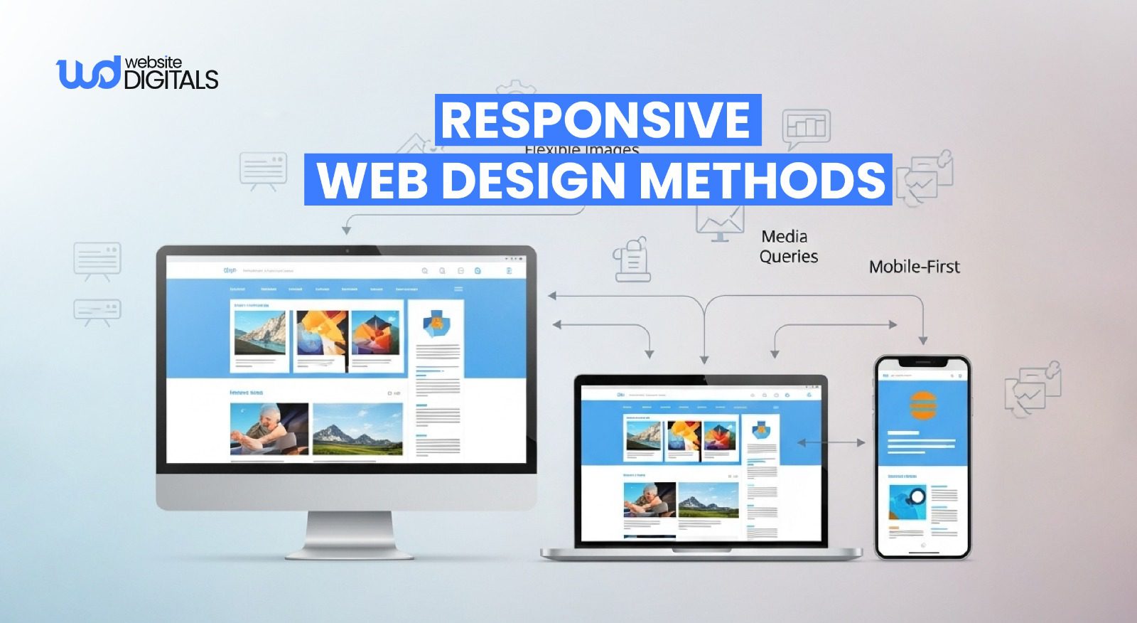
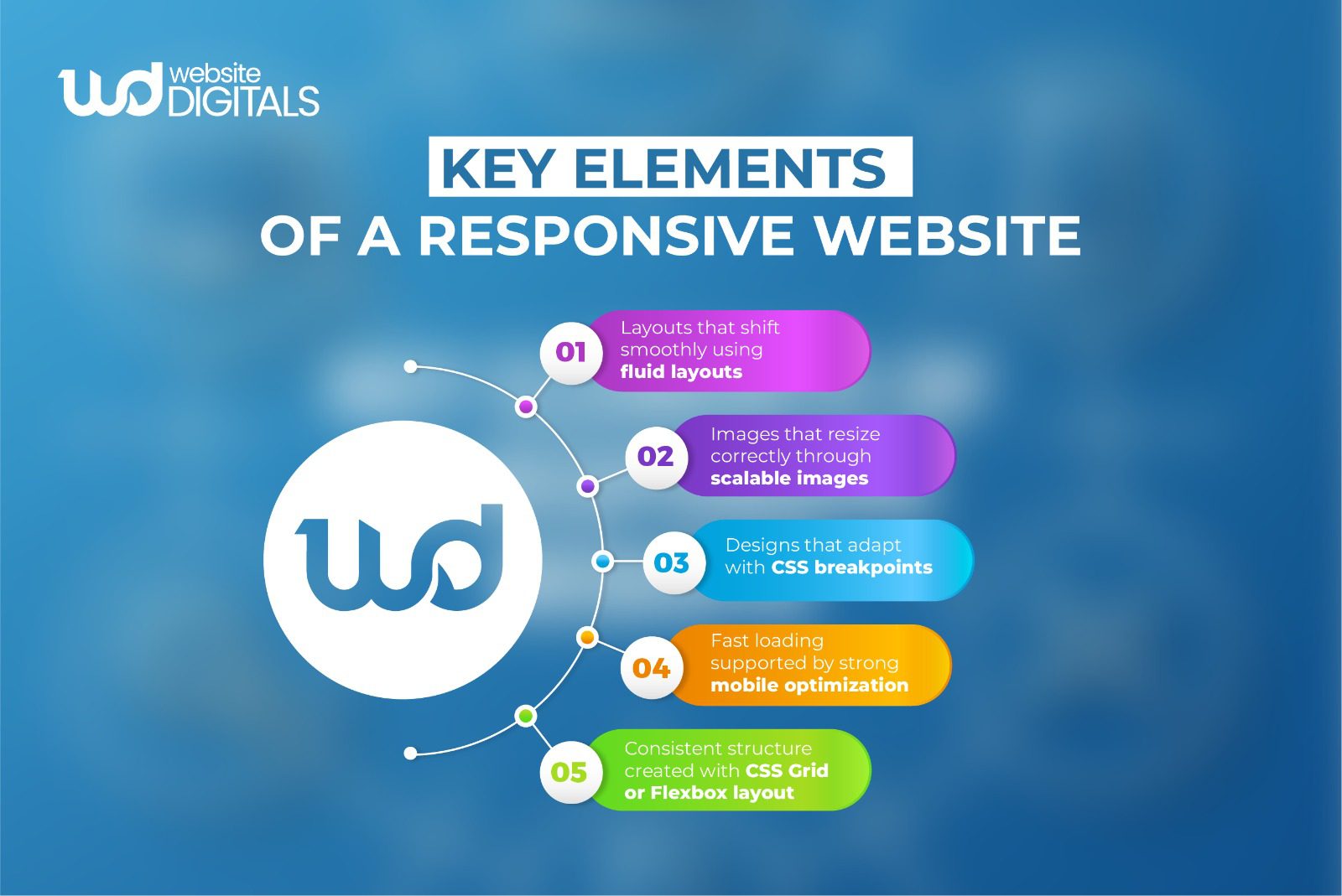
Essential Responsive Web Design Methods That Make a Real Difference
Modern responsive design relies on flexible structures, adaptive visuals, and device-focused styling, all working together to keep layouts consistent across screens.
Flexible structures such as fluid layouts allow content to adjust naturally based on available space.
Tools like:
- CSS Grid and Flexbox layout
Help keep designs balanced and readable.
Visuals also play a major role. Oversized images slow down mobile loading times and hurt web performance.
Techniques that use scalable images help achieve smooth content scaling and support fast-loading mobile pages.
Screen-specific adjustments are handled with CSS media queries and CSS breakpoints, which determine when layouts collapse, menus shift, or spacing changes.
These adjustments help maintain browser compatibility, better readability, and a more touch-friendly UI.
Tip:
|
If you’re not sure where to begin, working with a skilled web design company can help you implement responsive structures correctly from day one, saving you time and preventing layout issues later. |
Quick Comparison of Responsive Design Techniques
|
Method |
What It Improves |
Why It Matters |
|
Fluid Layouts |
Layout flexibility |
Reduces horizontal scrolling and improves readability |
|
Scalable Images |
Page speed |
Helps create fast-loading mobile pages and improved web performance |
|
CSS Media Queries |
Adaptive layouts |
Adjusts designs based on screen resolutions |
|
Mobile-First Strategy |
Clarity & focus |
Stronger mobile user experience |
|
Responsive Frameworks |
Development consistency |
Supports cross-device consistency and better browser compatibility |
Tip:
|
Layouts based on percentages create a more natural flow on phones and reduce awkward spacing issues. |
Why a Mobile-First Strategy Creates a Better Website Experience
A mobile-first strategy begins with the smallest screen and expands upward.
Starting with mobile encourages clarity, stronger focus, and more intentional design decisions. Once the mobile layout is set, additional details can be added for tablets and desktops.
This approach helps with readability, supports responsive fonts, and keeps layouts clean and easy to use, key parts of successful mobile optimization.
Bonus Point:
|
Beginning with mobile helps identify what your visitors truly need, creating a more focused and helpful layout. |
Top Tools and Frameworks That Make Responsive Design Easier
Using frameworks with built-in responsive support can speed up production and create more consistent results.
Systems such as Bootstrap responsive utilities and Tailwind responsive classes are reliable starting points.
Content platforms like WordPress also offer WordPress responsive themes, and developers working with JavaScript libraries can use React responsive components for interactive layouts that adjust smoothly across screen resolutions.
These tools support clean layouts, strong cross-device consistency, and easier long-term maintenance.
Tip:
|
Simple custom styling within these frameworks can give your design a more unique look without extending development time. |
Real World Case Study:
|
Starbucks transformed its digital experience by adopting a fully responsive web design that unified mobile, tablet, and desktop interactions. Their redesign focused on fluid layouts, touch-friendly UI, and device-adaptive interactions, ensuring that mobile users had the same frictionless experience as desktop visitors. After launching the responsive experience, Starbucks reported:
|
How Performance, Usability, and Accessibility Improve User Experience
A responsive website needs to load fast, look clear, and feel natural to use.
Slow loading frustrates users, especially on mobile devices.
Optimizing images, refining layout choices, and reducing unnecessary scripts can help improve speed.
Good usability also depends on thoughtful design decisions, such as spacing, easy-to-tap buttons, simplified forms, and readable typography.
These improvements support accessibility in responsive design and better overall usability.
Your mobile structure also influences search visibility. Using HTML5 responsive features and maintaining consistent content across devices supports stronger mobile SEO optimization.
Note:
|
Search engines often rely on your mobile layout, so it must match the quality and completeness of your desktop version. |
How Strong Responsive Design Helps Real Visitors Stay Longer
People visiting your site while comparing attorney website templates, browsing website redesign services, or looking to hire responsive web design services want a layout that works without effort.
If your site breaks, buttons overlap, or menus feel confusing, they’ll leave.
Clear spacing, clean structure, well-balanced visuals, and thoughtful mobile-first frameworks create stronger responsive web design examples that help visitors stay longer and move through your content comfortably.
Conclusion – Ready to Launch a Truly Responsive Site?
A website built with the right responsive web design methods feels clear, fast, and easy to use on any device.
When your layout adjusts smoothly and your content stays readable, visitors remain engaged and are more likely to trust your brand. An outdated or broken mobile experience, however, can drive potential clients away.
If you’d like to see how your site performs across key devices, you can schedule a free website audit with our experts at Website Digitals.
Reach us at info@websitedigitals.com or call (646)-222-3598, and we’ll help you understand exactly what your website needs to improve its responsiveness and overall user experience.
FAQs
Why should I choose Website Digitals for responsive web design services?
Website Digitals uses proven responsive web design methods to fix layout issues, improve mobile performance, and ensure your site looks and works flawlessly on every device. Our team focuses on clarity, speed, and long-term usability.
Does Website Digitals redesign existing websites to make them fully responsive?
Yes. Whether you’re dealing with layout shifts, slow mobile performance, or outdated themes, Website Digitals provides complete website redesign services to make your site stable, modern, and conversion-ready.
What are the best responsive web design methods?
The best methods include fluid layouts, scalable images, CSS Grid, Flexbox, and CSS media queries combined with a mobile-first strategy.
How does responsive web design work?
Responsive design adjusts layouts automatically based on screen size using flexible grids, breakpoints, and device-specific styling.
What are effective methods for creating mobile-responsive websites?
Start with a mobile-first approach, use flexible grid systems, optimize images, and apply CSS breakpoints for smooth adjustments.
Can you give examples of responsive design techniques?
Yes, fluid layouts, adaptive typography, collapsible menus, responsive images, and layout shifts controlled by media queries.
What are beginner-friendly responsive layout methods?
Beginners often start with Flexbox, CSS Grid, fluid containers, and frameworks like Bootstrap or Tailwind for easier layout control.
How do CSS media queries work in responsive design?
Media queries check the device’s width, height, or orientation and apply specific CSS rules to adjust layouts for different screens.