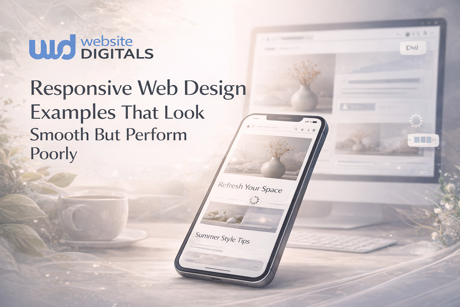
The Real Cost of Having the Worst Website Design in Your Industry

A buyer opens three tabs.
- One is your competitor.
- One is yours.
- The third never matters.
In that moment, the worst website design doesn’t lose you the deal outright; it quietly disqualifies you.
Adobe reports that 38% of users stop engaging with a site if the layout or visuals are unattractive. For buyers evaluating credibility, poor UX and dated visuals instantly tip the scale.
Paul Rand once said,
“Design is the silent ambassador of your brand.”
This guide explores how these split-second comparisons cost real revenue, and how redesigning for clarity and trust changes the outcome.
Key Takeaways
|

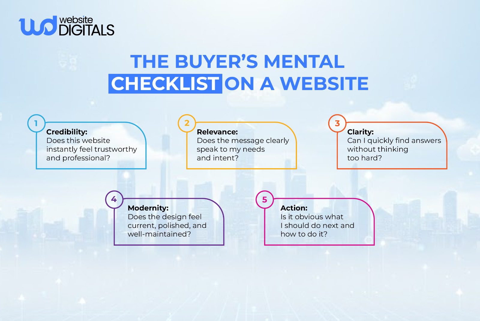
The UX Problems That Quietly Push Users Away
When we talk about website usability, we are talking about the ease with which a visitor can navigate your site to achieve a goal.
Unfortunately, many sites suffer from usability issues that remain invisible to the company but are glaringly obvious to the customer.
One of the most frequent navigation problems occurs when a company organizes its menu based on internal corporate structures rather than user needs.
When a visitor encounters a confusing navigation system, they feel an immediate sense of cognitive load.
If they have to hunt for a “Pricing” or “Services” page, their trust in your brand begins to erode.
An effective navigation structure should be intuitive.
It should anticipate the questions a buyer has and provide a clear path to the answers.
A cluttered website layout with too many competing links creates “analysis paralysis,” leading to a high bounce rate as users flee to a simpler alternative.
-
Mobile UX That Fails to Engage
We no longer live in a world where mobile is an afterthought.
A poor mobile experience is a death sentence for engagement.
If a site is an unresponsive design, it forces users to pinch and zoom just to read a paragraph.
Mobile users have different behaviors than desktop users.
They want quick answers and “thumb-friendly” buttons.
An outdated web design that isn’t optimized for smaller screens will see low user engagement and a sharp drop-off in mobile inquiries.
-
Slow Loading That Breaks Trust
Page load speed is more than just a technical metric; it is a fundamental part of the user experience.
Research consistently shows that users begin to drop off if a page takes longer than three seconds to load.
A slow loading website signals to a prospect that your company may be behind the times or lacks attention to detail.
Furthermore, Google uses speed as a ranking factor.
If your page speed optimization is neglected, your SEO performance will suffer, making it harder for new leads to find you in the first place.
Knowing how to fix slow website loading usually involves optimizing images, leveraging caching, and cleaning up bloated code.
-
CTAs That Do Not Convert
A Call to Action (CTA) should be the most obvious element on the page.
However, poor CTA placement, such as burying a “Request a Quote” button at the very bottom of a long text block, is a common mistake.
If your buttons blend into the background due to a lack of color contrast, they might as well not exist.
-
Accessibility Issues That Reduce Reach
Ignoring accessibility standards is not just a legal risk; it’s a business mistake.
A lack of accessibility, such as hard-to-read fonts, typography issues, or a lack of alt-text, excludes a significant portion of your potential audience.
When you prioritize accessibility, you ensure that every stakeholder at a potential client company can interact with your content, regardless of their physical abilities or the devices they use.
What High-Performing Websites in Your Industry Do Differently
The difference between the worst website design and a high-performing one isn’t just a fresh coat of paint.
It is a fundamental shift in how the site is engineered to support the buyer’s journey.
-
User Paths Designed for Decisions
Top-tier websites utilize information architecture to guide the user.
Instead of dumping all the information on the homepage, they use a clear visual hierarchy to highlight what is most important.
They understand user intent mapping, ensuring that a “top of funnel” visitor looking for education finds a blog, while a “bottom of funnel” visitor looking to buy finds a demo link.
-
Messaging That Builds Authority
In business, you are selling expertise and reliability, and this is why content readability is vital here.
If your text is a wall of jargon in a small font, no one will read it.
High-performing sites use trust signals, such as client logos, case studies, and clear testimonials, integrated naturally into the design to validate their claims.
-
Fast Performance Across Devices
A modern site must feature mobile responsiveness as a core component, not an add-on.
This means images resize automatically, menus transform into easy-to-tap icons, and layouts remain consistent.
This creates a seamless experience that keeps the conversion rate high across all platforms.
-
Consistent Visual Branding
An inconsistent branding approach, where colors, fonts, and tones shift from page to page, makes a company look disorganized.
Professional web development ensures that every page feels like part of a cohesive ecosystem.
This consistency builds the “brand muscle memory” that helps prospects remember you when they are ready to sign a contract.
-
UX That Helps Increase Website Leads
Ultimately, the goal of a redesign is to increase website leads.
High-performing sites achieve this by removing “friction points.”
They replace intrusive popups with helpful, contextual lead magnets.
They fix broken layouts that might obscure a contact form.
They turn the website into a 24/7 salesperson that works as hard as your actual team.
Real World Case Study:
|
A project that evaluated a cinema site found confusing navigation, poor mobile responsiveness, slow page load speed, and a clunky ticket booking flow. By redesigning navigation, optimizing responsiveness, and simplifying the booking process, user engagement and conversions improved because friction was directly addressed. |
Bonus Thought:
|
Despite widespread UX knowledge, many websites remain poorly designed because teams often prioritize features over human behavior, neglect usability metrics, or silo design decisions from product strategy. Aligning design with user research, intent mapping, and performance data, rather than aesthetics alone, is essential for meaningful improvement. |
Redesign vs UI/UX Audit vs Brand Refresh: Choosing the Right Fix
Before you commit to a full overhaul, it is important to understand exactly what is broken.
Not every site needs to be scrapped and rebuilt from scratch.
-
When a UX Audit Is Enough
If your site looks modern but your user experience metrics are down, you may only need a UX audit.
This is a deep dive into user experience (UX) and user interface (UI) to find where people are getting stuck.
An audit can identify specific usability issues that, once fixed, can significantly lower your bounce rate.
-
When Website Redesign Services Are Required
If your site is built on an ancient platform, suffers from an unresponsive design, or is generally considered the worst website design by your own team, it’s time for full website redesign services.
A full redesign allows you to rethink your entire digital strategy, from the ground up, ensuring your website is modern, secure, and scalable.
-
When a Brand Refresh Makes Sense
Sometimes the functionality is fine, but the look is an outdated design trend relic from 2010.
A brand refresh focuses on the “skin” of the site, updating the color contrast, fonts, and imagery, without necessarily changing the underlying navigation structure.
|
Service |
Best For… |
Key Focus |
|
UX Audit |
Identifying why users aren’t converting. |
Data, heatmaps, and user flow. |
|
Brand Refresh |
Updating an old “look” without changing the tech. |
Visuals, typography, and logos. |
|
Full Redesign |
Obsolete tech, poor mobile, and low leads. |
Strategy, structure, and performance. |
Aligning Web Development With Business Goals
A website shouldn’t just exist; it should perform.
Many businesses make the mistake of hiring a graphic designer who doesn’t understand the technical side, or a coder who doesn’t understand marketing.
To avoid common website pitfalls, your development team must focus on:
- Scalability: Can your site grow as your service offerings expand?
- Security: Are you protecting user data and maintaining professional trust?
- Integrations: Does your site talk to your CRM or email marketing tools?
When development aligns with business goals, the website becomes an asset that generates ROI, rather than a technical debt that requires constant patching.
How the Worst Website Design Creates Internal Business Friction
|
Internal Area |
How the Worst Website Design Creates Friction |
Downstream Impact |
|
Sales teams |
Constantly explaining or compensating for the website |
Longer sales cycles |
|
Marketing teams |
Landing pages underperform despite good campaigns |
Wasted ad spend |
|
Leadership |
No clear visibility into performance or ROI |
Poor strategic decisions |
|
Customer support |
Repetitive basic questions from users |
Higher support load |
|
Operations |
Manual fixes instead of scalable systems |
Slower growth |
What a Strategic Website Redesign Process Actually Looks Like
If you decide to move forward with a redesign, it shouldn’t be a guessing game.
A professional process is rooted in data and strategy.
1. UX and Conversion Discovery
The process begins by looking at your current user experience metrics.
- Where are people leaving?
- Which pages have the lowest readability?
By identifying these pain points early, the new design can be engineered to solve them specifically.
2. Research Based on Real User Behavior
We don’t design for what we think users want; we design for what they do.
This involves looking at heatmaps and click-tracking to see how users interact with your current information architecture.
3. Scalable Design Systems
Instead of designing individual pages, we build a “design system.”
This ensures that as you add new sections to your site, the visual hierarchy and branding remain perfectly consistent.
4. Web Development Built for Speed
During the build phase, the focus shifts to page speed optimization.
This includes clean coding practices and ensuring the site passes all modern performance benchmarks.
5. Ongoing Optimization and Tracking
A website is never truly “finished.”
Once the new site is live, we will continue to monitor the conversion rate and SEO performance.
This iterative approach ensures that your site stays ahead of the competition and never slips back into being the worst website design in your industry.
Taking the First Step Toward a Website That Supports Growth
If your site feels like a liability, the worst website design is likely costing you trust, leads, and revenue every day.
The real danger isn’t imperfection; it’s sticking with a website that creates friction, looks outdated, and undermines credibility.
A strategic website redesign shifts your site from a weak link into a conversion-focused asset built for clarity, speed, and confidence.
If you’re ready to stop losing opportunities to poor UX, our experts at Website Digitals can help you rebuild a high-performing website.
Contact us at info@websitedigitals.com or at (646)-222-3598 to connect with us to start a redesign that drives measurable growth.
FAQs
How does Website Digitals approach fixing bad website design?
Website Digitals audits layout, UX, performance, and visual hierarchy to identify what makes a website design bad, then rebuilds it for clarity, trust, and conversions.
Why do businesses choose Website Digitals for UX and website redesigns?
Businesses choose Website Digitals for data-driven design decisions that eliminate common web design mistakes and replace poor UX with conversion-focused experiences.
What makes a website design bad?
A website design is considered bad when it lacks clarity, has poor navigation, slow load times, inconsistent visuals, or ignores user intent.
Why does bad website design hurt conversions?
Bad website design hurts conversions because confusing layouts, weak CTAs, and poor UX increase friction and cause users to abandon the site.
What are some examples of poor website design?
Examples of poor website design include cluttered pages, unreadable typography, non-responsive layouts, broken navigation, and outdated visuals.
What are the most common web design mistakes businesses make?
Common web design mistakes businesses make include prioritizing aesthetics over usability, ignoring mobile users, slow performance, and unclear value propositions.
How can you identify bad UX design on a website?
You can identify bad UX design by high bounce rates, low engagement, user confusion, excessive clicks to complete tasks, and frequent abandonment points.