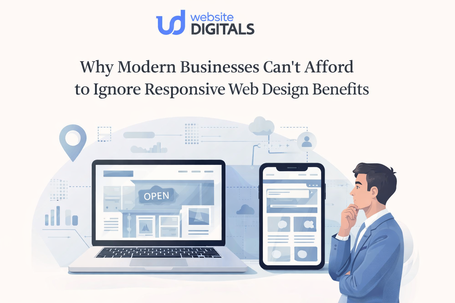
Responsive Web Design Examples That Look Smooth But Perform Poorly
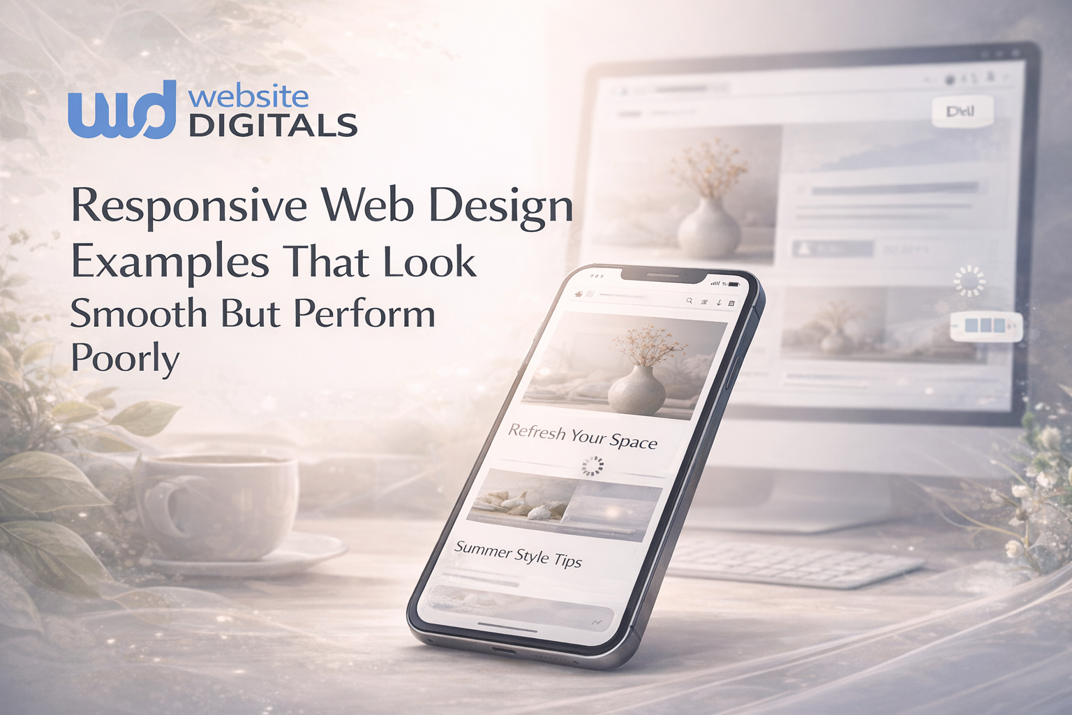
You’ve probably seen a website like this before.
It slides beautifully on your phone. The menu glides in. Images fade with polish. Buttons bounce just enough to feel modern. For a moment, it seems like a great example of contemporary design. Then the page hangs. The hero image takes too long. The text jumps. The checkout button sits just below the fold, and the whole experience starts to feel less “premium” and more exhausting.
That’s the quiet problem with many responsive web design examples people admire at first glance: they look refined, but they do not perform where it matters most. A responsive layout is not the same thing as a responsive experience.
That distinction matters now more than ever. StatCounter reports that mobile accounted for 52.48% of worldwide web traffic in February 2026, which means more than half of your visitors are likely judging your site through a smaller screen, a tighter connection, and a shorter attention span.
Key Takeaways
- A responsive layout can still create a poor user experience if it is heavy, unstable, or hard to navigate.
- Good responsive design balances appearance, speed, clarity, and cross-device usability.
- The strongest sites treat performance as part of design, not something added later.
- If your site feels smooth but converts poorly, the problem may be hidden inside images, scripts, layout choices, or mobile UX.
What Does Responsive Design Actually Mean?
Responsive design is an approach that makes a page adapt to different screen sizes and viewing contexts instead of forcing separate fixed layouts for every device. That basic definition aligns with both the transcript you shared and Google’s explanation of responsive design as a strategy that changes layout to suit users’ devices and needs.
But here is what most people get wrong: responsiveness is not just about shrinking blocks until they fit. A site can pass the visual test and still fail the human test.
Ethan Marcotte, who coined the term, put it simply: “Fluid grids, flexible images, and media queries are the three technical ingredients for responsive web design.” That is still a useful foundation. The problem is that many teams stop at the ingredients and forget the meal.
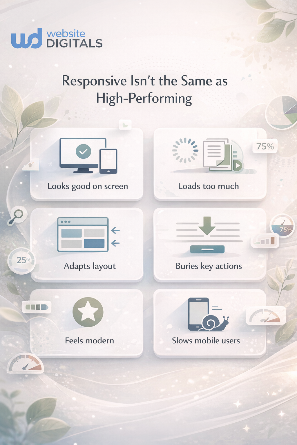
The Real Tension: Why “Smooth-Looking” Sites Can Still Disappoint
A website can look modern because it uses motion, card layouts, flexible sections, and full-width visuals. None of that guarantees a good experience.
You feel the problem in smaller moments:
- The page loads beautifully, but only after too much waiting
- The text scales, but becomes harder to read
- The layout stacks properly, but key actions get buried
- The images fit the viewport, but weigh down the page
- The menu works, but takes more taps than it should
Why Do Some Responsive Web Design Examples Feel Good At First And Still Perform Poorly?
Because they were designed to impress in a preview, not to work under pressure.
In the transcript, several responsive essentials show up clearly: viewport behavior, responsive images, text that adapts to screen width, and media queries that reflow multi-column layouts into single-column experiences. Those are not optional details. They are the mechanics that make responsive design actually function. When those mechanics are used carelessly, the site still appears “responsive” while quietly becoming harder to use.
The Four Friction Points To Watch
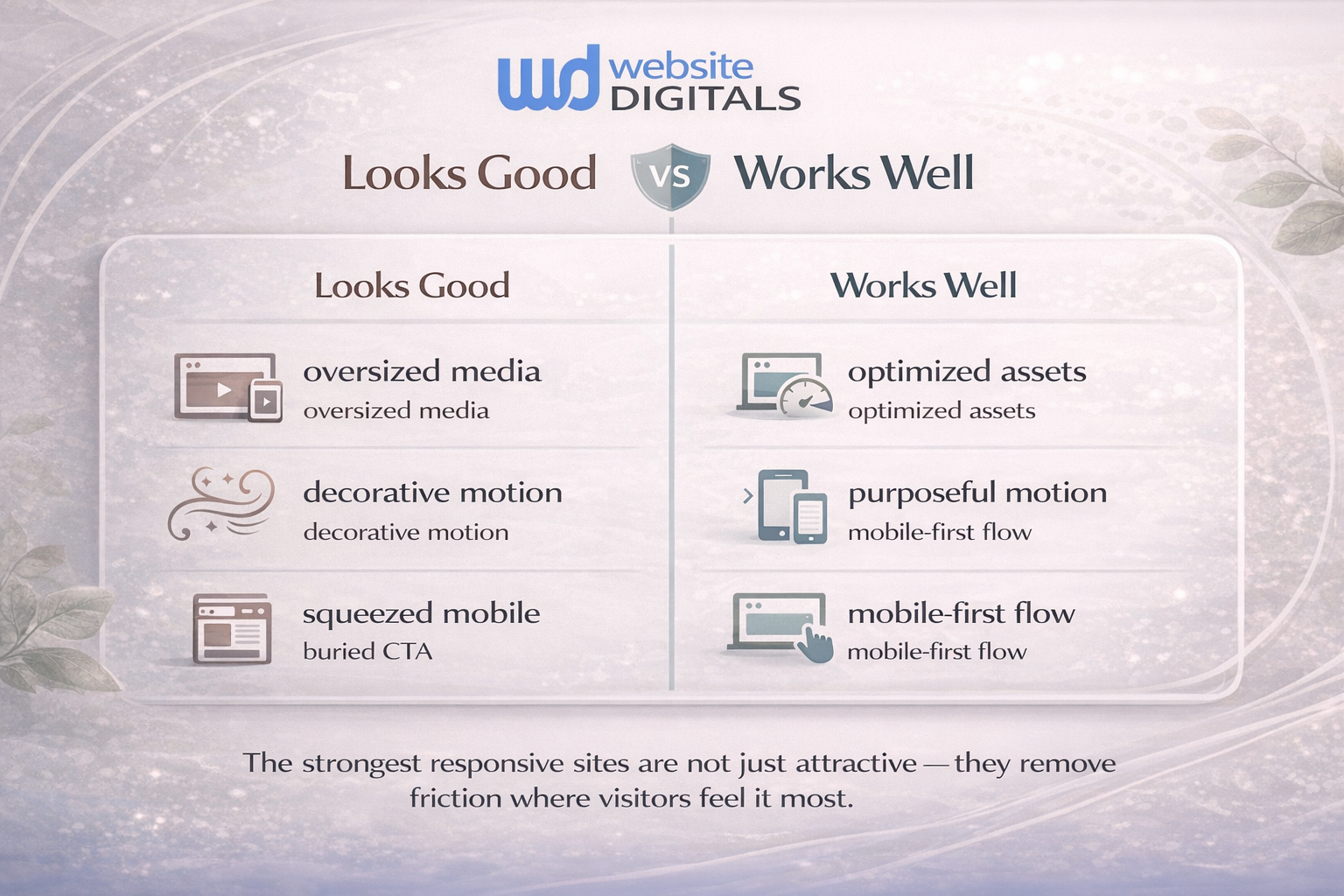
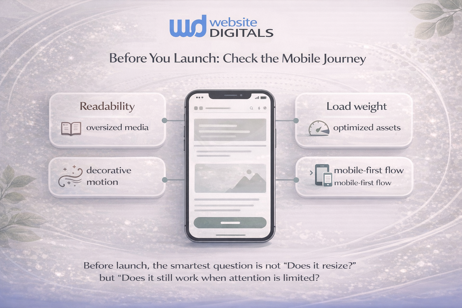
1. Heavy visuals hiding inside a flexible layout
A site may use responsive image techniques, but if the underlying images are oversized, the page still drags. Flexible images help layout, not automatically performance.
2. Motion replacing clarity
Animation can guide attention, but too much motion creates delay, distraction, and friction. Smooth is not the same as useful.
3. Breakpoints without content thinking
A layout that snaps from three columns to one column may technically respond well. But if the most important content drops too far down, the user pays the price.
4. Mobile design treated like a smaller desktop
Luke Wroblewski helped popularize the mobile-first mindset for a reason: mobile is not a shrunk desktop. It is a different reading context, a different decision speed, and often a different goal. Google’s responsive design guidance also emphasizes designing for device capabilities and user needs, not just screen width.
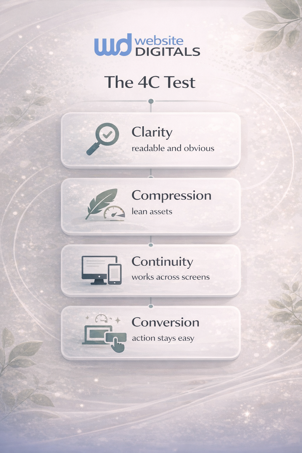
A Simple Framework: The 4C Test
This is the easiest way to judge responsive web design examples without getting lost in design trends.
1. Clarity
Can someone understand the page fast? Headline, hierarchy, buttons, and text should stay obvious on smaller screens.
2. Compression
Do images, scripts, and interface choices stay lean? A site that needs too much downloading rarely feels as good as it looks.
3. Continuity
Does the experience remain coherent as the viewport changes? Navigation, forms, pricing tables, and product grids should still make sense when stacked.
4. Conversion
Can people complete the action that matters? Buy, book, subscribe, call, request a quote. If the action gets buried, the design is failing the business.
How Should You Evaluate Responsive Website Examples Before Copying Them?
Use this quick checklist before you borrow inspiration from any gallery, competitor, or template.
- Open the page on your phone, not just a desktop preview.
- Watch what happens to images, text, and calls to action.
- Notice whether motion helps understanding or only adds polish.
- Ask how quickly a visitor can complete the main task.
- Check whether the design still feels readable and trustworthy under real conditions.
That sounds basic, but it catches what admiration misses.
Reality Check
|
What you notice |
What it often means |
Why it hurts |
Better cue |
|
Large hero looks impressive but loads slowly |
Oversized media or poor image handling |
Slower first interaction |
Use responsive images and prioritize visible content |
|
Menu animation feels polished |
Too much JavaScript for a simple task |
Delayed navigation |
Keep mobile menus fast and direct |
|
Text scales down too much |
Layout over-prioritized aesthetics |
Lower readability |
Protect font size and spacing first |
|
Grid stacks neatly on mobile |
Breakpoints are working visually |
Core actions may still get buried |
Reorder content around intent, not just columns |
|
Page looks modern in screenshots |
Design built for presentation |
Weak real-world usability |
Test on live devices and slower connections |
What Most People Get Wrong About Responsive Design
Here’s the trap: people compare examples of responsive websites by surface quality instead of operational quality.
Do this, not that
- Do this: design around what the visitor needs first
Not that: design around what looks impressive in a portfolio shot - Do this: treat performance as part of UX
Not that: treat speed as a developer fix after launch - Do this: make mobile decisions early
Not that: squeeze the desktop version later - Do this: test content hierarchy at every breakpoint
Not that: assume a neat stack equals a good journey
W3C’s accessibility guidance is useful here too. Accessibility is not separate from responsiveness; it supports it. Clear structure, readable text, and workable interaction patterns help more people across more contexts.
A Familiar Scenario You’ve Probably Seen
A small ecommerce brand hires a designer to refresh its storefront. The new site looks sharp. Product cards are cleaner. The typography feels more current. On a desktop review, everyone is happy.
Then the numbers settle in.
Mobile visitors scroll deeper before they find filters. Product images take too long on category pages. Add-to-cart buttons sit too low on some devices. The redesigned store is more “beautiful,” but less decisive. Nothing is obviously broken. That is what makes it dangerous.
This is where the difference between best responsive websites and merely attractive ones becomes clear. The best-performing examples do not just resize gracefully. They protect attention.
How Website Digitals Approaches Responsive Design More Responsibly
For businesses, the goal is not to win a design compliment. It is to make the site easier to use, easier to trust, and easier to act on.
That means building with a few grounded priorities:
- mobile-first design decisions, not mobile cleanup later
- flexible grid systems that respect content hierarchy
- responsive images that fit both viewport and performance needs
- media queries that support readability, not just rearrangement
- conversion paths that remain obvious across devices
This is where experience matters. A team that understands adaptive vs responsive design, cross-device compatibility, Core Web Vitals, and content hierarchy can often spot the hidden friction faster than a team chasing aesthetics alone. Google’s responsive design resources and learning materials continue to emphasize that responsive work should help sites “look great and work well for everyone.”
Conclusion
The hardest part about weak responsive web design examples is that they rarely fail in obvious ways. They fail in hesitation. In extra seconds. In friction that feels small until it starts costing trust, attention, and conversions.
So when you review modern responsive web design examples, look beyond the polish. Ask whether the layout stays clear, the assets stay light, the experience stays coherent, and the action stays easy. That is where good design becomes good business.
If your site looks current but feels underwhelming in results, the answer may not be a bigger redesign. It may be a smarter, performance-led one.
If your website feels slow despite looking great, it’s time to rethink performance. Connect with Website Digitals at info@websitedigitals.com or call (646)-222-3598 to explore your opportunities.
FAQs
What are responsive web design examples?
They are websites that adapt their layout, content flow, and visual structure across different screen sizes. Good examples do more than resize; they stay readable, fast, and easy to use.
Why responsive design is important for business websites?
Because visitors arrive on different devices, and the experience needs to remain clear and usable across all of them. Responsive design also supports better mobile usability and stronger search visibility when paired with performance and accessibility best practices.
How responsive web design works in simple terms?
It uses flexible layouts, responsive images, viewport settings, and media queries so content can adapt based on the available viewing space rather than one fixed screen size.
What is the difference between responsive design vs adaptive design?
Responsive design flexes continuously across viewports, while adaptive design typically relies on preset layouts or breakpoints prepared for specific screen ranges. The transcript you shared captures this distinction well through the shift from fixed layouts to more fluid behavior.
What should I look for in top responsive website examples 2026?
Look for clarity on mobile, lightweight assets, obvious calls to action, strong readability, and stable layouts. The best examples are not just pretty; they help users finish tasks quickly.
Which responsive website design tools comparison matters most for non-developers?
Focus less on brand hype and more on what the tool supports: mobile-first layout control, image handling, performance options, accessibility, and ease of content editing. Those factors matter more than flashy demos.
How do Website Digitals build responsive sites that perform better?
Website Digitals focuses on responsive design as a business system, not just a visual treatment. That includes content hierarchy, mobile-first UX, lighter assets, clearer conversion paths, and performance-aware front-end execution.
Is Website Digitals a good fit for businesses comparing the best responsive web design companies?
It is a strong fit for brands that want responsive websites built for speed, usability, and conversions rather than appearance alone. That matters especially for small businesses, ecommerce stores, and growth-focused teams that need every page to work harder.