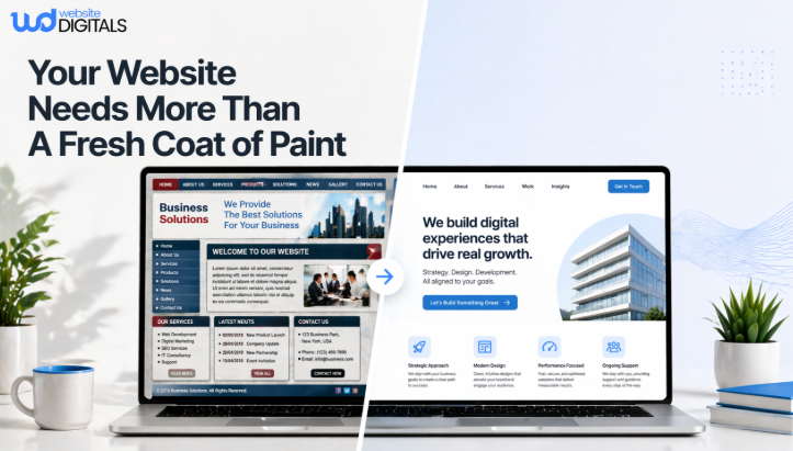
Why Modern Businesses Can’t Afford to Ignore Responsive Web Design Benefits
A business owner opens analytics on a Monday morning and sees something confusing.
Traffic looks healthy. Interest is there. People are landing on the site.
But leads are thin, sales feel inconsistent, and mobile visitors seem to vanish almost as quickly as they arrive.
That kind of problem rarely starts with a loud warning. It starts quietly, in the tiny moments that customers feel before they ever fill out a form or buy a product.
Text feels cramped. Buttons sit too close together. A menu hides what matters. A checkout field refuses to behave. On the desktop, the site looks polished. On a phone, it feels like work.
That is why responsive web design benefits matter so much now. Mobile is no longer a side screen.
As of February 2026, mobile accounts for 52.48% of global web traffic, which means more than half of web visits begin in the palm of a hand.
Key Takeaways
- Responsive design affects trust, discoverability, and conversions, not just appearance.
- A site that works beautifully across screens removes friction before it becomes lost revenue.
- Search visibility increasingly depends on mobile usability and overall page experience.
- Businesses that delay responsive improvements often pay twice: first in drop-offs, then in redesign costs.
What Are The Responsive Web Design Benefits Businesses Actually Feel?
Responsive web design is the practice of building one website that adjusts its layout, media, and navigation to fit different screens, resolutions, and devices while preserving usability. In plain terms, it helps the same site work well on phones, tablets, laptops, and desktops without forcing visitors to pinch, zoom, or hunt for basic actions.
The most important point is easy to miss: visitors do not separate “design,” “performance,” and “ease of use” in their minds. They only feel one thing. Either the website respects their time, or it does not.
|
Steve Jobs put it simply: “Design is not just what it looks like and feels like. Design is how it works.” |
That line lands because it describes the real business question. Not whether a site looks modern in a presentation. Whether it works when someone is distracted, in a hurry, on weak mobile data, with one thumb, trying to decide whether the business feels credible enough to trust.
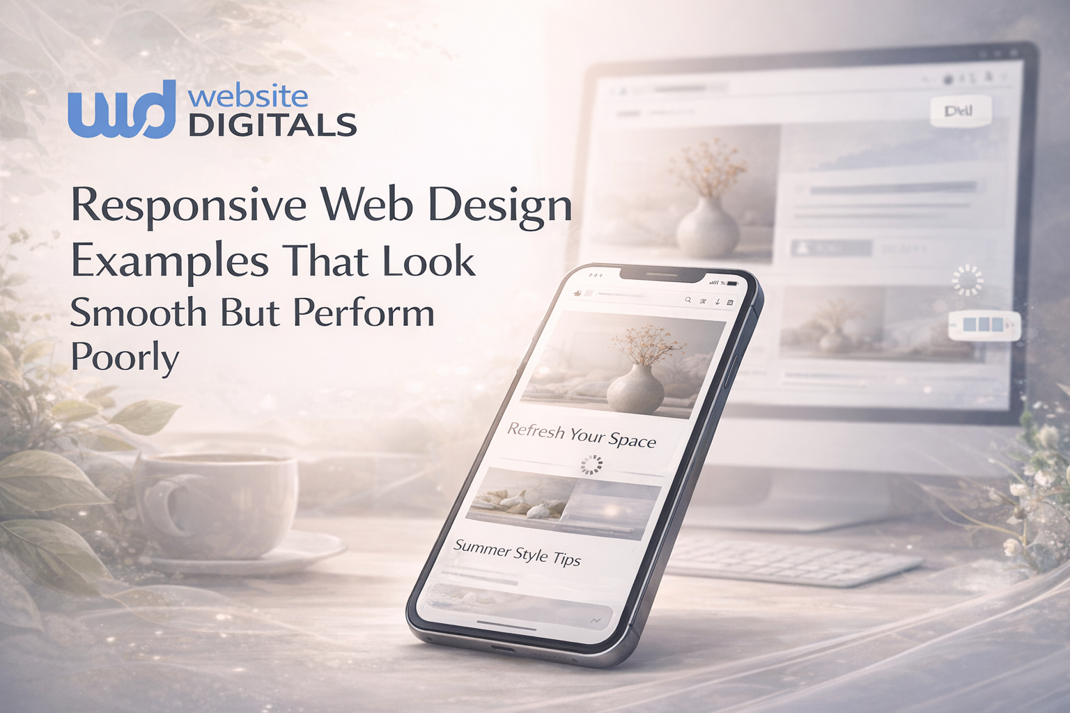
What Happens When A Site Looks Fine On Desktop But Fails On A Phone?
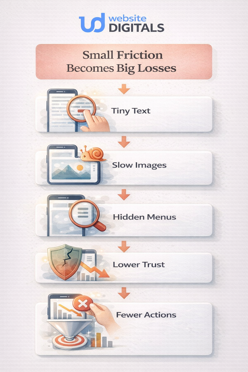
A non-responsive site usually does not fail dramatically, but fails in little interruptions.
A visitor lands on the homepage from a search. The headline wraps awkwardly. The navigation covers half the screen. The call button is too small. The service page loads a large image before the real message appears. A contact form asks for too much. The visitor leaves, not because the offer was bad, but because the experience felt heavier than the alternative.
That friction shows up in all the places that matter: bounce rate, user engagement, time on site, form completion, and checkout confidence. It also affects visibility.
Google says it uses the mobile version of a site’s content for indexing and ranking, and its page experience guidance explicitly asks whether content displays well on mobile devices and whether pages provide good Core Web Vitals.
The most useful responsive web design examples are not the flashy ones. They are the quiet ones, where content stays readable, buttons stay tappable, and the customer barely notices the layout adapting because everything simply works.
Why The Real Value Goes Beyond Layout
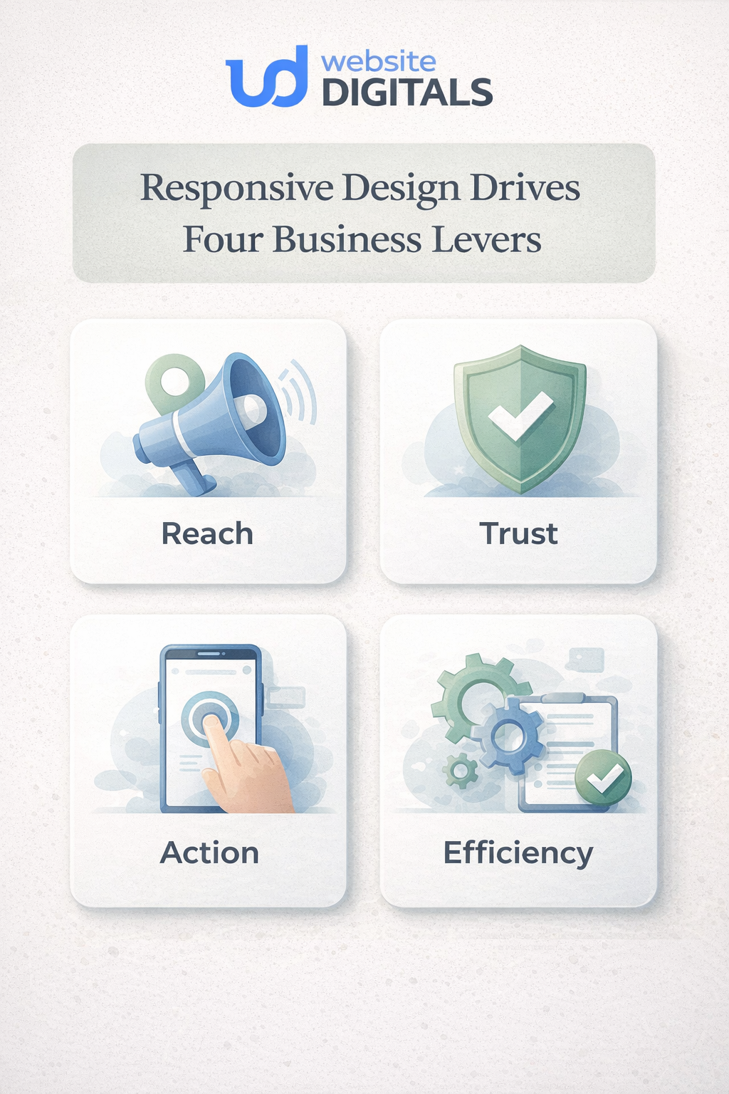
When businesses talk about the benefits of responsive web design, they often stop at one idea: “the site fits smaller screens.” That is true, but it is not enough. The deeper value sits in four business levers.
1. Reach
A responsive site supports cross-device compatibility, which means a business can meet people where they already are. Screen sizes change. Orientations shift. Network conditions vary. A strong mobile-friendly website accounts for that reality instead of fighting it.
2. Trust
Clarity creates credibility. When headings stay readable, forms feel manageable, and layouts remain stable, visitors sense competence. That feeling matters more than many teams realize. Good UI/UX design often earns trust before the sales copy has even finished speaking.
3. Action
Responsive design for conversions is mostly about reducing hesitation. Strong page responsiveness keeps the path to action obvious: book, call, buy, request a quote, compare options, or ask a question.
4. Efficiency
Maintaining one flexible site is usually simpler than patching together separate experiences. That is one reason the importance of responsive web design extends beyond marketing. It affects operations, content updates, testing, and long-term decision-making, too. Of all responsive web design methods, the ones that matter most are the ones customers can feel: simpler navigation, faster-loading media, stable layouts, and consistent paths to action.
Around the middle of most redesign discussions, the same confusion appears: is the team investing in aesthetics, SEO, usability, or sales? The honest answer is that responsive work touches all of them at once.
|
Business priority |
What responsive design improves |
What the customer notices |
What teams often miss |
|
Search visibility |
Mobile usability, cleaner structure, consistent content |
Pages are easier to read and use |
Rankings are affected by experience as well as relevance |
|
Lead generation |
Clear forms, better tap targets, simpler contact paths |
Asking for help feels easy |
Hidden friction on mobile kills intent |
|
Ecommerce sales |
Product browsing, filters, carts, checkout flow |
Buying feels straightforward |
Desktop success can hide mobile loss |
|
Brand trust |
Stable layout, readable type, consistent experience |
The business feels professional |
Credibility is often built before the copy is read |
|
Ongoing maintenance |
One flexible system instead of scattered fixes |
Fewer broken moments over time |
Responsiveness is not a one-time launch task |
How Does Responsive Design Improve Seo Without Becoming A Technical Maze?
This is where many articles get too abstract. The connection is actually practical.
Google’s mobile-first indexing guidance says the mobile version of a site is used for indexing and ranking. Its page experience documentation also makes clear that good Core Web Vitals, secure delivery, and content that displays well on mobile all contribute to a stronger overall page experience.
So, responsive web design benefits for SEO are less about a secret trick and more about alignment. One clear content structure. One easier-to-maintain experience. Fewer awkward mobile failures. Better consistency between what a searcher expects and what they actually get.
That matters because search performance is not won only by being discovered. It is also protected by what happens after the click.
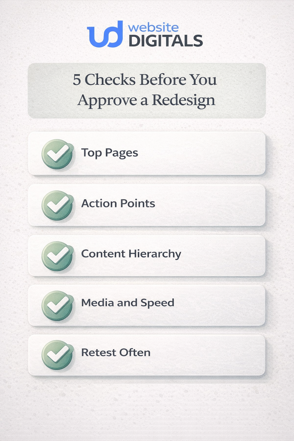
A Practical Way To Judge Whether A Redesign Will Actually Help
Before approving mockups, a business should ask one simple question:
Will this site feel easier to use on a phone at the exact moment a customer is ready to act?
That question reveals far more than a style presentation ever will, and it is the question any careful web design company should be prepared to answer.
A useful five-part audit looks like this:
- Check the top-entry pages on a phone first. Home, service, product, pricing, and contact pages matter more than perfecting every corner.
- Watch the action points. Calls, forms, carts, calendars, chat buttons, and menus should feel obvious and forgiving.
- Test the content hierarchy. Important messages should appear early, not after endless scrolling past decorative blocks.
- Review media and performance. Heavy images, unstable layouts, and cluttered sections quietly drain attention.
- Retest after every meaningful update. New plugins, banners, scripts, and content can reintroduce friction just when a site seemed fine.
That is also why mobile-first design works so well. It forces clarity. It asks what must be visible, tappable, and understandable before there is room for anything extra.
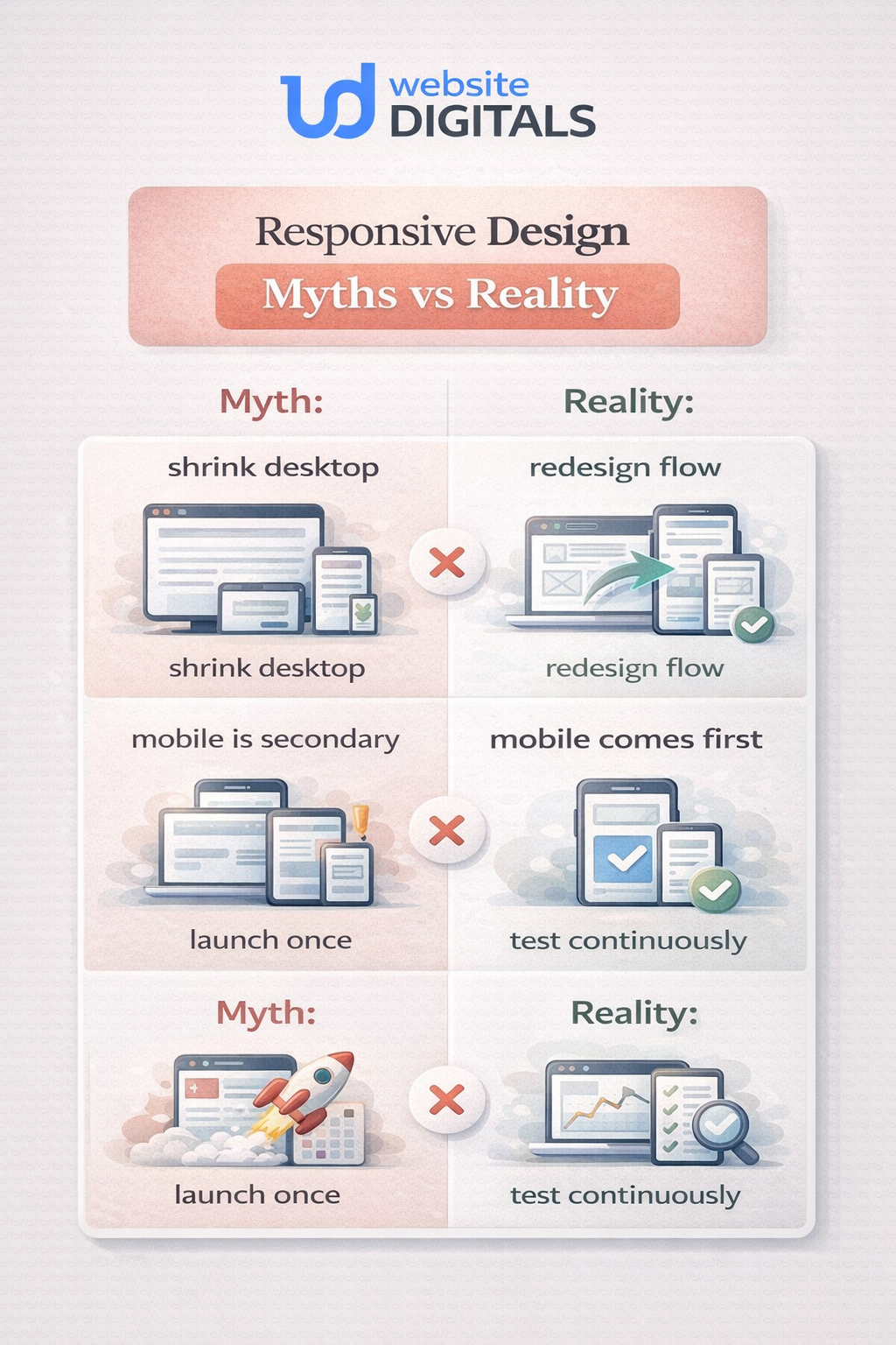
What Most Businesses Get Wrong About Responsive Work
The biggest misunderstanding is thinking responsive design means shrinking a desktop layout until it fits.
It does not.
Responsive design uses flexible layouts, thoughtful responsive breakpoints, adaptable typography, flexible images, and CSS media queries so the interface responds to the viewport instead of merely surviving it.
A few common mistakes show up again and again:
Do this, not that
- Do: prioritize the mobile journey first.
- Not that: treat mobile as a smaller version of a desktop.
- Do: keep the same core content available across devices.
- Not that: hide essential information on mobile and hope search visibility stays unaffected.
- Do: simplify menus, forms, and calls to action.
- Not that: add more moving parts because the site feels “empty.”
- Do: treat responsiveness as part of website performance and accessibility.
- Not that: treat it like a visual polish layer.
A Familiar Ecommerce Pattern That Proves The Point
Businesses exploring responsive web design services for eCommerce often think the biggest issue is visual inconsistency. Usually, the bigger issue is hesitation.
Picture an online store with strong products and decent traffic.
On the desktop, the catalog feels clean. On mobile, filters crowd the screen, product cards stack awkwardly, images dominate above the fold, and checkout asks for too much before trust is earned.
Nothing is technically broken. But everything feels one step harder than it should.
After a thoughtful responsive redesign, the change is not magical. It is practical. Product grids breathe.
Tap targets widen. The cart stays visible. Key reassurance messages move closer to the buy decision. Forms become shorter. Page responsiveness improves.
Suddenly, the store is not asking shoppers to work around the website.
The same pattern shows up for service businesses, too. The best benefits of mobile responsive websites are often invisible to the team that built the site because the people inside the business already know where everything is. Visitors do not. They need the path to be obvious.
Why This Matters Even Beyond Design
Responsive work should never be separated from performance and security.
A layout that adapts beautifully but loads too slowly still frustrates people. A site that looks modern but feels risky at checkout still loses trust. Google’s page experience guidance asks site owners to think broadly about mobile display, secure delivery, and usability, not as isolated wins but as parts of one experience.
That broader view is what most businesses need. Not a prettier homepage. A stronger digital front door.
Conclusion
The real responsive web design benefits are not limited to aesthetics. They shape how a business is discovered, how trustworthy it feels, how easy it is to buy or inquire, and how expensive the website becomes to maintain over time.
That is why responsive web design is important. It protects the customer journey at the exact moment attention is fragile. It gives businesses a better chance to be understood, trusted, and chosen across the screens people actually use.
For businesses ready to stop guessing and start improving, Website Digitals offers strategic support for responsive redesigns that focus on usability, search visibility, and conversion paths.

FAQs
What are the benefits of responsive web design?
They include better usability across devices, stronger mobile engagement, clearer paths to action, and easier long-term maintenance.
Why is responsive web design important for small businesses?
It helps smaller brands avoid losing leads on mobile, protect credibility, and compete without maintaining separate site versions.
How does responsive web design improve SEO?
It supports mobile usability, content consistency, and better page experience signals, all of which align with how Google evaluates pages.
How does responsive design work?
It uses flexible layouts, adaptable media, and CSS media queries so a page can respond to screen size, resolution, and device context.
Responsive web design vs adaptive design: what is the difference?
Responsive design reshapes one flexible layout fluidly. Adaptive design typically serves preset layouts for specific screen ranges.
Does responsive design improve conversions?
It often helps because it removes friction from forms, navigation, product browsing, and checkout steps.
What should businesses expect during the first conversation with the team about a responsive redesign?
They should expect a review of user journeys, mobile pain points, priority pages, and the actions that matter most, such as calls, forms, or sales.
Can an existing site be improved without rebuilding everything?
Sometimes yes. If the structure is sound, targeted changes to layout, hierarchy, media handling, and mobile usability can create meaningful gains without a full rebuild.