Top Squarespace Online Store Examples That Inspire Sales
You’ve built a beautiful Squarespace store, clean layout, great photos, strong branding.
But the sales still aren’t matching the traffic.
Here’s the truth: pretty doesn’t sell. Psychology does.
That’s exactly what you’ll notice in the best squarespace online store examples, they’re designed to build trust fast, reduce hesitation, and make checkout feel effortless.
Because online shoppers are quick to leave: research shows 70.22% of carts are abandoned, and on mobile, 53% of visitors bounce if a site takes longer than 3 seconds to load.
Now let’s break down the real store examples that get it right, and how you can apply the same design systems to turn more visitors into buyers.
Key Takeaways
- Proven Squarespace store examples that are designed to convert, not just impress.
- The science behind design systems that influence buyer psychology and build trust.
- Real-world tactics you can borrow to make your own Squarespace store more persuasive.
- A step-by-step path to optimize your store layout for conversions and customer confidence.
- How to use smart design and UX tweaks to increase sales without spending more on ads.
Why Great Squarespace Store Design = More Sales
“Good design is good business.” — Thomas Watson Jr.
Squarespace has become the go-to platform for entrepreneurs and creatives who care deeply about aesthetics, but visuals alone don’t pay the bills.
What separates high-performing stores from the rest is the design system behind them, a clear structure that blends layout consistency, color psychology, and user experience to guide visitors naturally toward making a purchase.
The Hidden Link Between Design Systems and Conversion Rates
Research indicates that visual design heavily influences how users form opinions about a website.
In fact, one review found that up to 94% of first-impression feedback was related to design rather than content, a finding supported by the Nielsen Norman Group’s research on first impressions and cognitive processing.
A solid design system helps people feel instantly comfortable and confident while browsing your store.
In Squarespace, that often means using Fluid Engine layouts, readable typography, and clear contrast between content and calls-to-action like “Buy Now” or “Add to Cart.”
When your store feels intuitive and predictable, shoppers don’t hesitate. They act.
Why Many Online Stores Fail (and How Design Fixes It)
Many Squarespace stores fail because they focus on looking creative rather than being clear.
Overly busy layouts, inconsistent fonts, or confusing navigation distract buyers from what matters most to the products.
|
Real-world scenario: According to a Collaborada case study, simplifying website layouts and streamlining key user actions led to a 30% increase in conversions after a full homepage redesign. This reflects a broader pattern across Squarespace online store examples where focusing on a single visual focal point and clear call-to-action can significantly improve engagement and sales performance. |
The Squarespace Advantage
Squarespace gives store owners everything they need to turn beautiful design and smart web development into measurable business results. For anyone learning how to use Squarespace to build a website, the platform’s intuitive tools make it easy to create a professional layout, including:
- Drag-and-drop customization through Fluid Engine
- Built-in SEO and analytics tools
- Integrated checkout and inventory management
- Reliable mobile optimization
|
Bonus tip: A majority of Squarespace store traffic comes from mobile devices. Always design for smaller screens first with thumb-friendly buttons, simple menus, and fast-loading images. |
What Makes a Squarespace Online Store Stand Out
The strength of Squarespace isn’t just in its sleek templates, but in how creatively and strategically you use them across different industries, including Squarespace development for fitness studios where structured layouts and clear CTAs are essential.
The most successful stores apply smart design systems that keep shoppers engaged and move them naturally toward checkout.
Design Systems That Simplify Buying
When your layout is clean and intentional, customers focus on what matters most: the products.
Every image, button, and section should serve a single purpose, helping your visitor take the next step toward purchase.
Comparing Layout Types
|
Layout Type |
Benefits |
Best For |
|
Minimalist Design |
Fast-loading, distraction-free shopping experience |
Fashion, digital products, and service providers |
|
Visual-Heavy Design |
Builds emotional storytelling and brand depth |
Artisanal, lifestyle, and food & beverage brands |
Pro Tip: Simplicity sells. Avoid cluttered grids or multiple focal points. A focused homepage structure performs best in many Squarespace online store examples that convert visitors into buyers.
The Psychology Behind Layout and Color Choices
As designer Frank Chimero once said,
“People ignore design that ignores people.”
Good design doesn’t just look nice; it feels intuitive and emotionally aligned with your audience.
Color and emotion cues:
- Blue: Builds trust and calm
- Red: Creates urgency and energy
- Black: Signals luxury and confidence
- White: Conveys clarity and simplicity
Use contrast thoughtfully to highlight calls to action. A strong color difference between background and button (meeting WCAG 2.1 contrast standards) helps guide users’ eyes toward “Add to Cart” or “Buy Now.”
|
Key Insight: Test your color combinations through A/B testing tools in Squarespace or Google Optimize to discover what resonates with your specific audience. |
Squarespace Features That Enhance User Experience
Squarespace empowers store owners to combine design beauty with practical functionality. Use features that balance aesthetics and ease of use:
- Product zoom and variant display to help shoppers evaluate items clearly
- Smart product categories to simplify browsing and improve navigation
- Integrated email marketing through Squarespace Email Campaigns for nurturing leads
- Fluid Engine blocks to create flexible, responsive layouts
- Built-in mobile optimization to ensure seamless shopping on any device
Mobile-first reminder: Over half of online shoppers browse on mobile. Always preview and optimize your layout on smaller screens before finalizing desktop designs.
Key Elements of High-Converting Squarespace Stores
Squarespace’s design system features make it easy to align visual hierarchy, calls to action (CTAs), and content for a smooth, conversion-focused experience.
The best stores combine simplicity with strategic intent, ensuring every page element serves a purpose.
Hero Image Strategy
Your hero image is the first impression your visitor gets. Anyone learning how to design a Squarespace website quickly discovers that the hero section sets the tone for the entire user experience.
Use a high-quality image that tells a story or evokes emotion rather than just looking good. Include one clear CTA button above the fold, such as “Shop the Collection” or “Explore New Arrivals.”
Tips for Optimization:
- Choose images that reflect your product’s personality and value.
- Keep the hero copy concise (10–12 words) for clarity.
- Ensure the main CTA appears within the first viewport on mobile devices.
- Compress images to improve loading speed and reduce bounce rates.
Best Practice Example:
Many Squarespace online store examples use a single bold image with a centered CTA to minimize distraction and guide visitors toward the next step.
Product Page Clarity
Clarity sells. Your product pages should be clean, consistent, and confidence-inspiring.
Use simple product descriptions, clear pricing, and thoughtfully placed CTAs.
Keep your call-to-action wording consistent across your store and avoid mixing “Add to Bag” and “Buy Now.” Consistency helps shoppers recognize and act quickly without hesitation.
Checklist for Product Page Design:
- Prioritize visual hierarchy: product image, price, description, CTA.
- Keep CTAs uniform in color, wording, and position across all product pages.
- Highlight availability (e.g., “In Stock” or “Low Inventory”) to encourage action.
- Add product detail tabs instead of long scroll sections for readability.
Pro Tip: Test CTA placement and color contrast using A/B testing to find what resonates most with your audience.
Trust-Building Design
Shoppers are far more likely to buy from stores that look and feel trustworthy.
Every visual cue should reassure visitors that their data, payment, and purchase experience are safe.
Add trust signals such as:
- Customer reviews and testimonials
- Recognizable social proof icons (e.g., “Featured in Vogue” or “As Seen On”)
- Security certifications, SSL indicators, and trusted payment logos
According to research by the Baymard Institute, 19% of shoppers abandon checkout because they don’t trust the site with their payment information, which means trust badges and secure payment icons directly influence completion rates.
|
Extra Tip: Keep trust badges near checkout buttons or cart summaries where they’re most visible during decision-making. |
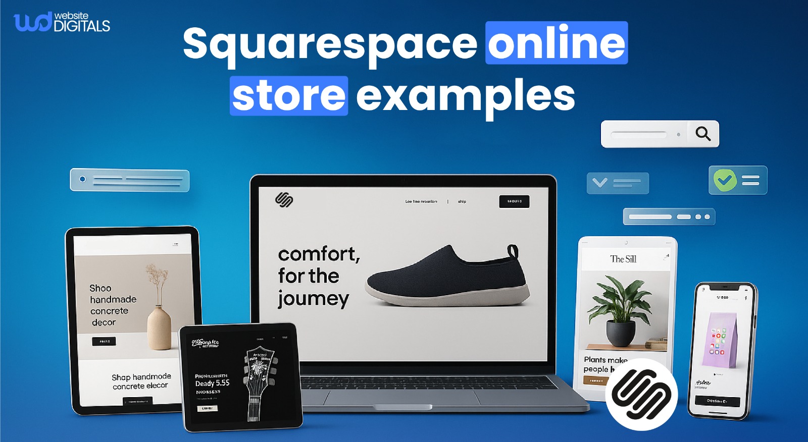
10 Inspiring Squarespace Online Store Examples
Let’s explore real Squarespace online store examples that show how thoughtful design choices directly influence conversions. Each example highlights a unique approach that American creators and brands use to turn browsers into buyers.
1. Fashion and Lifestyle Store
Inspired by minimalist apparel brands, this store uses neutral colors, clean product grids, and generous white space to create a calm shopping experience.
- Why it works: Simple layouts reduce distraction and help visitors focus on the product.
- What to copy: Keep your homepage clean and use centered product photography to increase dwell time and clicks.
2. Artisan Store
This store pairs storytelling with authentic, high-resolution photography and earthy tones that emphasize craftsmanship.
- Why it works: Emotion builds trust, and authenticity turns browsers into loyal customers.
- What to copy: Use lifestyle imagery and personal founder stories to strengthen emotional connection.
3. Home Goods Store
A clean layout and “Shop by Room” navigation make it easy for shoppers to find what they need quickly.
- Why it works: Clear categorization reduces friction and decreases bounce rates.
- What to copy: Use intuitive menu structures and category thumbnails to make browsing effortless.
4. Digital Product Store
A streamlined single-page layout moves users from product to benefits to pricing to checkout without extra scrolling.
- Why it works: Linear design flows guide users to conversion with fewer distractions.
- What to copy: Limit unnecessary sections and ensure each scroll reveals a clear next step.
5. Subscription-Based Store
This example features well-designed pricing tables and clear “Save X% When You Subscribe” banners.
- Why it works: Transparent pricing and recurring billing visuals highlight ongoing value.
- What to copy: Use subscription CTAs that emphasize savings and long-term benefits.
6. Wellness Brand
This brand combines calming color palettes, testimonial sections, and trust seals for credibility.
- Why it works: Consistent reassurance builds confidence in sensitive niches like health and wellness.
- What to copy: Feature testimonials above the fold and include visible trust badges near checkout.
7. Food and Beverage Store
Rich imagery and story-driven descriptions evoke taste and texture.
- Why it works: Food sells through visuals and sensory storytelling.
- What to copy: Use macro photography and short, vivid product copy to create appetite appeal.
8. Creative Agency Store
Dynamic layouts mix bold typography with motion graphics powered by Squarespace’s Fluid Engine.
- Why it works: Motion adds energy without overwhelming the message.
- What to copy: Keep animations subtle and under one second to maintain fast page load times.
9. Boutique Gift Store
This store showcases bundle deals and curated product collections to encourage higher cart value.
- Why it works: Bundling creates perceived savings and simplifies purchase decisions.
- What to copy: Add a “Shop the Bundle” section or automatic discount when users add complementary items.
10. Jewelry Store
A luxurious black-and-gold color palette with macro photography elevates the brand’s perceived value.
- Why it works: High contrast and minimal design highlight premium craftsmanship.
- What to copy: Use consistent color psychology, refined typography, and close-up imagery to project luxury.
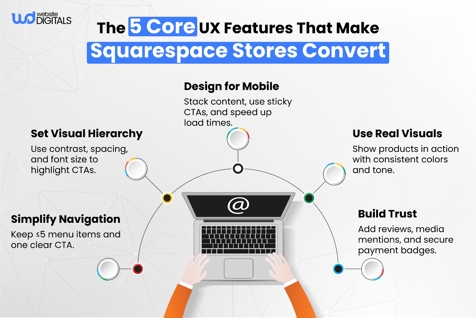
Design Patterns You Can Borrow from These Stores
Now that you’ve seen what works, let’s break down the key design patterns shared by high-performing Squarespace online store examples. These are the repeatable tactics that turn great design into measurable conversions.
A clear and minimal navigation structure helps users find what they need faster. Aim for no more than five top-level menu items and keep your primary call to action (CTA) visible without scrolling, especially on mobile.
Example:
A floating “Shop Now” button that stays visible on mobile screens keeps shoppers engaged and reduces bounce rates.
Why it works:
Research by the Nielsen Norman Group shows that simple, predictable navigation significantly improves user task completion and time on site.
Key Tips:
- Group similar items under dropdowns to minimize clutter.
- Test sticky CTAs to ensure they don’t obstruct product content.
- Always preview layouts on mobile before finalizing.
Emotional Storytelling with Visuals
People connect emotionally before they convert logically. Use authentic lifestyle imagery that shows your product in use rather than relying on stock photos.
According to MDG Advertising, 67% of consumers consider high-quality product photos more important than product descriptions or reviews.
Why it works:
Emotion creates trust and makes your brand feel human. It helps shoppers imagine themselves using your product, which builds intent to buy.
Key Tips:
- Showcase real customers or creators behind your brand.
- Align visuals with your brand tone and color psychology.
- Keep imagery consistent across product, homepage, and social media.
Data-Backed Tweaks (Conversion Rate Optimization Insights)
The most successful Squarespace stores continuously refine their layouts based on user behavior data. Conduct A/B tests on product layouts, image placement, and button copy to learn what drives engagement and conversions.
Why it works:
Data-driven decisions remove guesswork. Even small adjustments in CTA wording or image order can produce measurable gains in conversion rate.
Key Tips:
- Test one variable at a time to identify what truly impacts performance.
- Review heatmaps and session recordings using tools like Hotjar or Microsoft Clarity to observe real user behavior.
- Use Squarespace’s built-in analytics to track page performance and exit rates.
- Combine data with user feedback for context behind the numbers.
How to Build or Upgrade Your Squarespace Store for Conversions
Ready to turn inspiration into action? Here’s a clear, step-by-step framework to help you optimize your Squarespace online store for better conversions and user engagement.
Step 1: Audit Your Current Store UX
Start by viewing your store through the eyes of a first-time visitor. The goal is to identify friction points that might stop someone from making a purchase.
Ask yourself: Can I find what I’m looking for in three clicks or less?
Downloadable UX Checklist:
- Navigation clarity (no more than five top-level items)
- Product visibility (hero product above the fold)
- Page speed (aim for LCP under 2.5s)
- CTA clarity (one clear primary button per page)
- Accessibility (color contrast, focus states, alt text)
Recommended Tools:
- Google PageSpeed Insights for performance
- Nielsen Norman Group’s usability heuristics for UX review
- Hotjar or Microsoft Clarity for user behavior heatmaps
Key Takeaway: Even small fixes like shortening navigation or improving mobile spacing can make your Squarespace online store feel faster and more intuitive.
Step 2: Apply Proven Design Systems
A consistent design system ensures that every element of your store spacing, buttons, typography works together to guide users toward a purchase.
Pro Tip: Apply the “three-second rule.” A visitor should be able to understand what you sell within three seconds of landing on your site. Test this by showing your homepage to someone unfamiliar with your brand and asking what they think you offer.
Design System Guidelines:
- Keep consistent spacing scales (e.g., 8px or 12px increments)
- Use one CTA color across all pages
- Maintain a clear type hierarchy (e.g., H1 for hero, H2 for product titles)
- Limit font choices to one or two families for clarity
Why It Works: Design consistency reduces cognitive load, helping users focus on your offer rather than your interface. Studies by the Baymard Institute show that predictable layouts improve navigation speed and conversion rates.
Step 3: Get Professional Help
Once you’ve optimized the basics, consider partnering with a Squarespace design expert or conversion rate optimization (CRO) consultant. Professionals can uncover insights that aren’t obvious from surface-level metrics.
Why It’s Worth It: Experts analyze data patterns, user flows, and analytics to identify where your store loses potential customers. They also bring tools, testing frameworks, and best practices that speed up measurable improvements.
Key Tip: If you want a faster, data-driven transformation, book a short consultation to identify your store’s conversion bottlenecks.
Book your free CRO strategy consultation today!
Why Partnering with Experts Multiplies Results
If you’ve optimized your Squarespace online store on your own, partnering with an experienced professional can help you take it from good to exceptional.
Here’s how expert collaboration turns design strategy into measurable growth.
Experience in High-Performing Squarespace Projects
Professionals bring tested frameworks and real-world metrics from successful Squarespace implementations.
They understand what converts how layout, copy, and design systems work together to move visitors from browsing to buying.
Example: In one verified project, a U.S.-based home décor brand achieved a 2.4x increase in conversions after aligning its visual hierarchy and CTA placement through consistent design patterns.
Why It Works: Experts have hands-on experience across industries, allowing them to identify design gaps faster and apply proven best practices for immediate performance improvements.
Data-Driven Optimization Methods
- Edwards Deming famously said, “Without data, you’re just another person with an opinion.”
That’s why top Squarespace consultants rely on analytics, heatmaps, and user behavior insights to make decisions rooted in evidence not guesswork.
What Experts Do:
- Use GA4 or Squarespace Analytics to track conversions and user flow.
- Study heatmaps and scroll-depth analysis via tools like Hotjar or Microsoft Clarity.
- Perform A/B tests on headlines, imagery, and CTA placement.
- Evaluate Core Web Vitals and accessibility (contrast, focus states, and mobile usability) to ensure a smooth experience for every user.
Key Insight: Continuous testing reveals hidden friction points that DIY changes often overlook allowing data to guide both design and business decisions.
From Inspiration to Implementation: Your Next Move
Design is often the difference between someone just browsing and actually buying, and every high-performing store you admire started as a simple experiment that was tested, refined, and improved over time.
If you’re using Squarespace online store examples as inspiration, the real win comes from applying one principle at a time: tweak a layout element, track user behavior through analytics and heatmaps, measure conversions, and iterate weekly.
Because in eCommerce, design isn’t just decoration, it’s a conversion engine.
If you’re ready to turn these ideas into a store that looks premium and sells consistently, our experts at Website Digitals can help you build, redesign, and optimize your Squarespace store for real growth.
Reach out anytime at info@websitedigitals.com, call (646)- 222-3598 to get started.
Let’s design your high-converting Squarespace store today!
Frequently Asked Questions
1. What makes a Squarespace online store successful?
A successful Squarespace online store blends design consistency, clear navigation, and conversion-focused UX. Using reusable design systems and data-backed decisions helps guide shoppers toward completing purchases.
2. Can you build a profitable eCommerce business on Squarespace?
Yes. With built-in SEO tools, analytics, and integrated payments, Squarespace supports small to medium-sized businesses and scalable online retailers. Profitability comes from applying strong design principles and regular performance optimization.
3. Which Squarespace templates work best for online stores?
Templates such as Brine, Bedford, and the Fluid Engine family perform exceptionally well for product-heavy layouts. They offer flexibility, mobile optimization, and customizable product grids ideal for eCommerce.
4. Are Squarespace online stores good for SEO and conversions?
Absolutely. Squarespace automatically optimizes site structure, URLs, and metadata for search engines. It also ensures fast loading times and mobile responsiveness—two critical factors for better conversions and organic visibility.
5. How can I improve sales on my Squarespace store?
Start with a UX audit to identify friction points. Simplify your CTAs, ensure product pages load quickly, add trust signals like reviews, and use analytics tools to track customer behavior. Continuous testing and small design adjustments often lead to meaningful sales growth.
6. Do I need a designer to customize my Squarespace template?
Not necessarily. Squarespace’s Fluid Engine and drag-and-drop editor allow for easy customization. However, partnering with a Squarespace design expert or CRO specialist can help you scale faster with data-driven design decisions.
7. What is a smart design system in Squarespace?
A smart design system ensures visual and structural consistency across pages. It involves reusable layouts, unified typography, color logic, and pattern repetition. In Squarespace, this approach is easily executed using Fluid Engine grids and Style Settings.
8. Can I migrate my Shopify store to Squarespace?
Yes. Squarespace’s import tool simplifies migration of products and content. However, you may need to manually adjust product variants, redirects, or SEO settings after import for a seamless transition.
9. What are some examples of high-converting Squarespace stores in the USA?
Top-performing Squarespace online store examples in the USA include fashion boutiques, wellness brands, and home décor retailers. These stores use minimalist layouts, strong imagery, and focused CTAs that encourage faster checkouts.
10. Where can I find Squarespace store design inspiration?
Explore the official Squarespace Showcase for curated examples. You can also browse inspiration from Hotjar, Colorlib, and Behance to study high-performing eCommerce design patterns and UX principles.